Some home décor trends will never go out of style! Whether it is the minty green or sage green, dusty pink, baby blue, or a lighter beige backdrop, pastel kitchens are something to look forward to!
And ever since the deadly pandemic hit the world – what better time to choose soothing colors in homes and kitchens, if not now?
Well, incorporating a lovely pastel on your cabinets or backdrop walls is a great way to invite a refreshing and calm vibe!
Moreover, these hues will intentionally bring positive vibes to your home while exhibiting that ‘warm’ character.
So, excited to know how to best incorporate a tinge of relaxing and eye-catchy pastel in your home?
Well! Let’s have a look at these phenomenal 11 pastel kitchen ideas that are totally worthy of admiration, over and over again!
Pastel Kitchens To Die For
Sage Green Says It All
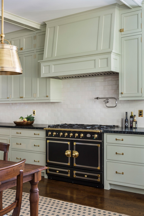
Sage green kitchen cabinets have a certain charm that makes them one of the most soothing and tranquilizing options to have!
Yes, they anticipate a sense of calmness and soothe when used especially on the cabinets. So, ensure to splash a little sage green in amalgamation with brushed brass pull handles and drawers for a perfectly cohesive palette.
Depending upon the size of your kitchen, the hue can vary from a very tone of sage to a very dark tone of sage green!
On the other hand, even the idea of sage green kitchen walls is something you can have an eye on! (And pair with crisp or creamy whites on the cabinets for a flabbergasting look)
Sherwin Williams Sea Salt is a must-try for pastel kitchens! (Check out my color review in the link)
Blue Pastel Kitchens
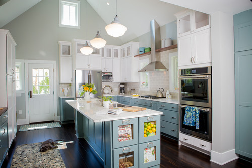
It is time to let go of your Monday blues with this absolutely charming and mesmerizing blue kitchen that plays tremendously composed and peaceful!
Especially the pastel blues and baby blues are to be considered that share synonyms with calm, peace, and tranquility!
Trust me, you would absolutely love the feel of these blue kitchen cabinets in your space!
Furthermore, are you wondering what that blue cohesive palette would look like?
Well, try blending these subtle blues with either matte black, chrome, or brass-tinted metal accents in addition to white on the upper cabinets!
Sherwin Williams Stardew is something to have an eye on! (Check out my color review in the link)
Drool-worthy Gray Kitchen Cabinets
Don’t admire a ton of color splash in your kitchen?
Well, monochromatic gray is equally pretty and soothing for your pastel kitchens.
However, I recommend opting for lighter shades of gray for a totally soothing appeal. Generally, you can even have an eye on the tasteful combination of gray and white kitchen.
On the other hand, if space size and scale allow – you always have the opportunity to splash gray on both the cabinets – upper and lower!
And since gray plays versatile, you can add chrome, black, nickel, or brass on your pull handles for drawers.
Lastly, let white glossy backsplash tile conclude your palette!
Sherwin Williams Big Chill is a must-try on the kitchen cabinets! (Check out my color review in the link)
Embrace a Restful Pale Blue Kitchen
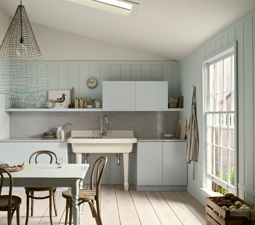
This particular tone of blue differs from the rest! And do you know why?
Well, it is neither too cold nor too blue – rather a subtle tone that adds a crisp background to your kitchen backdrop.
This beach-style kitchen is a perfect addition to your coastal-style homes – so, it is time to embrace those pale blue kitchen cabinets.
Furthermore, you can best pair with a quartz countertop, light gray backsplash, crisp whites on the backdrop walls, and brass or nickel pull handles.
Lastly, this is one of the best pastel kitchen ideas to have and embrace for a crisp and calm background.
Sherwin Williams Topsail is a must-try on the kitchen cabinets! (Check out my color review in the link)
Crazy For Lilac Kitchen
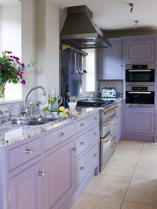
Another cool-toned hue, there is something just so soothing and beautiful about dusty and pale purple!
Yes! And this hue will never even go out of style.
So, I highly recommend choosing lilacs and lavenders on the cabinets of your kitchen. Moreover, try pairing this hue with white on the backdrop wall for a perfectly cohesive look.
Whether matte black or brass-tinted pull handles, lilac kitchen cabinets are something to have an eye on!
You can choose a lighter shade on the cabinets and various patterns on the backsplash and floors to perfectly conclude the design!
Mint Green Kitchen Blast
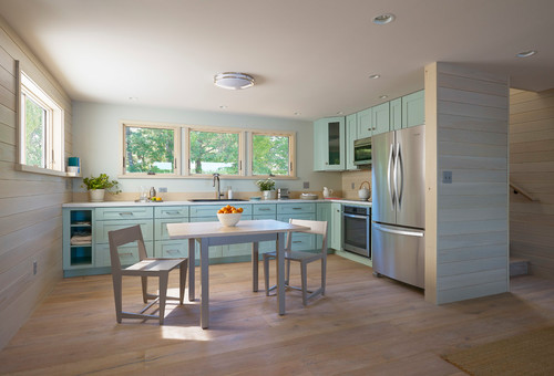
The cherry mint green kitchen plays equally refreshing and charming!
Even though the color doesn’t fall on the pastel side – it still feels absolutely pure and soothing.
You can best amalgamate the mint green kitchen cabinets with chrome fixtures and certain peach tones for a perfectly eclectic look.
You can either choose off-white paint on the walls or choose a lighter tone of mint green to imbibe a sense of creativity and eccentricity!
It is best to paint only the lower cabinets in this color as it will not feel too feminine, overwhelmed, or child-like.
A Candy-Inspired Peach Kitchen
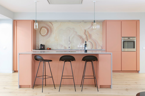
One of the most soothing and pure pastel kitchens involves splashing a tinge of blush, peach, salmon, or coral.
Yes! This color feels quite soothing and calm when used on the kitchen cabinets – hence, a great way to induce some sobre and subtle vibes.
Peach kitchens are absolutely Instagram-worthy – so, in case you plan to use it – you can either choose it on the cabinets or the backdrop wall.
Moreover, try pairing this hue with matte black pull handles, pendant lighting, and ample luxe marble on the countertop or the backsplash!
Sherwin Williams Rosy Outlook is something to have an eye on! (Check out my color review in the link)
Let Yellow Kitchen Cabinets Shine Bright
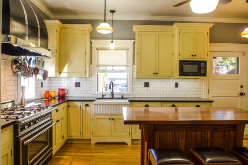
Who says yellow doesn’t play exotic and tranquilizing at the same time?
Well, this mid-century modern kitchen definitely proves flawless and stunning!
So, ensure to not go bold – rather, choose a lime yellow or pale yellow that makes your kitchen look spacious and soothing!
Pale yellow is a definite color for your pastel kitchens – and you can best pair it with matte black pull handles, white backsplash tiles, and white veined marble countertop.
On the other hand, if too much yellow bothers the vibe of your space – you must choose yellow kitchen décor in amalgamation with lower yellow kitchen cabinets for a totally vibrant look.
Don’t Ignore the Beauty of White Kitchens
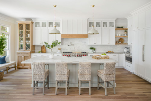
When designing one of your next dreamy pastel kitchens, don’t forget the beauty and timelessness of whites and off-whites!
Well, truly! White kitchen cabinets are going to always leave an everlasting impression on your space.
Generally, it is better to choose creamy whites or whites with warm undertones for a welcoming appeal.
Moreover, the versatility allows ample accent opportunities – for instance, the brass, bronze, matte black, and chrome on the pull handles.
Secondly, let exposed wooden textures further complement your palette when paired opposite these calm whites.
They will undoubtedly help your kitchen look airier, spacious, and extremely ‘beachy like’!
Sherwin Williams Snowbound and Sherwin Williams Alabaster are a must-try for pastel kitchens! (Check out my color review in the link)
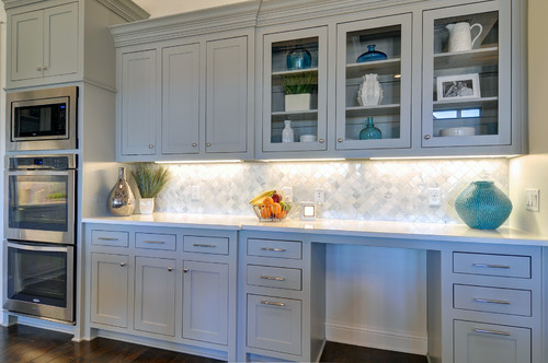
Pastel Kitchens With Focal Backdrop
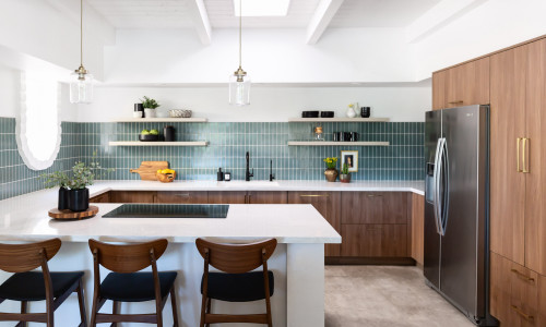
It is not necessary that you always have to paint your cabinets in a soothing color to achieve the most appealing appearance.
Sometimes, you can play with your pastel kitchens through backsplash tile, lighting fixtures, and accent seating for an absolute cohesive look.
Have a look at the contemporary-styled kitchen – isn’t it totally bliss?
The blue-green tiles on the backsplash play absolutely soothing and calm with this white and wooden backdrop wall.
Lastly, you can always add matte black pull handles and fixtures for a completely refined look.
Mix and Match Pastels
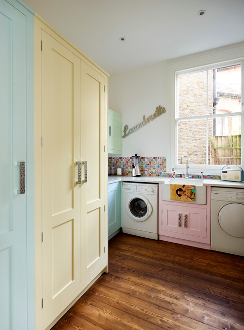
One of the best ways to make your pastel kitchens stand out is by pairing several tones of pastel hues all together – cohesively.
Mixing and matching the tones of mint green with baby pink, lime yellow, and off-whites will perfectly create a soothing vibe!
Not only will this palette foster a friendly and vibrant vibe but also add a sense of welcomeness!
Ensure to choose matte black for your pull handles and pure white sheen on the backdrop wall. Lastly, choose any three colors to avoid any confusion in your pastel kitchens.
Summing it Up
Pastel kitchens have a certain charm! Not only are they positively working with your mindsets but also offering immense timelessness. So, did you particularly adore the above-mentioned pastel tone? Would you like to have one in your home? Well, do let me know your thoughts in the comments below!