
You don’t need an expensive renovation to make your home feel more luxurious, sophisticated, and high-end. Sometimes, the right paint color can completely transform a space. A well-chosen hue can highlight architectural details, complement your furniture and finishes, and create a polished, designer look that makes a home feel more elevated.
The ultimate key is to choose colors with the right undertones, depth, and warmth. Soft whites, sophisticated greiges, earthy neutrals, rich taupes, and deep, moody shades can all create an expensive-looking backdrop when paired with the right materials and lighting.
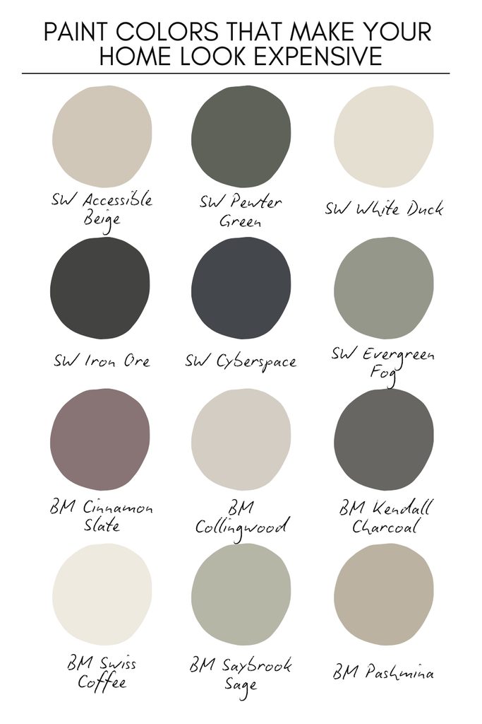
In this guide, I’m sharing 12 paint colors that make your home look expensive from Sherwin-Williams and Benjamin Moore. These are versatile shades that work beautifully across living rooms, bedrooms, kitchens, dining rooms, and open-concept spaces.
Whether you’re refreshing one room or choosing a whole-house color palette, these designer-inspired paint colors can help create a home that feels timeless, cohesive, and beautifully elevated—without requiring a luxury-sized budget.
12 Paint Colors That Make Your Home Look Expensive: Benjamin Moore & Sherwin Williams
Sherwin Williams Accessible Beige
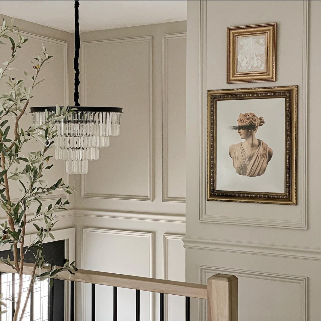
Sherwin-Williams Accessible Beige is a sophisticated warm greige that can instantly give your space a more polished and timeless look. The balanced blend of beige and gray creates a soft, refined backdrop without feeling too cool or overly yellow. SW Accessible Beige works beautifully in living rooms, bedrooms, dining rooms, hallways, and open-concept spaces, making it a versatile whole-home neutral as well.
It pairs exceptionally well with natural wood, creamy whites, black accents, brass, stone, and warm textiles. Depending on the lighting, it can appear warmer and more beige or slightly grayer. If you want a neutral paint color that makes a home feel elegant, cohesive, and elevated, SW Accessible Beige is a beautiful choice.
Sherwin Williams Pewter Green
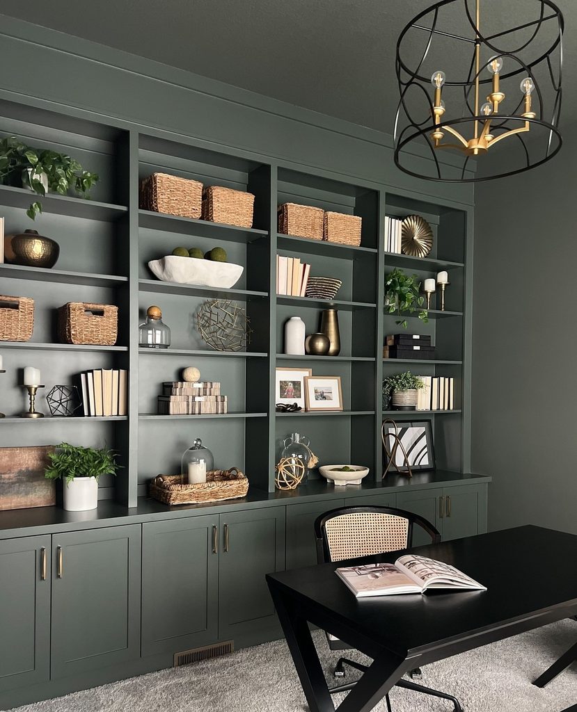
Sherwin-Williams Pewter Green is a rich, muted green with strong gray undertones. This color has the potential to give your space the ultimate sophistication and a grounded feel. This beautiful and popular green-gray paint color can potentially make your space feel moody and dramatic as well – especially, when color-drenched!
SW Pewter Green is an excellent choice for kitchen cabinets, bathroom vanities, built-ins, accent walls, offices, and dining rooms. It can also be used on an exterior for a dramatic yet natural look. Pair it with warm whites, creamy neutrals, natural oak, walnut, brass, marble, and stone for a layered designer aesthetic. If you’re looking for a sophisticated green-gray paint color that adds depth and character, Sherwin-Williams Pewter Green is a beautiful choice.
Sherwin Williams White Duck
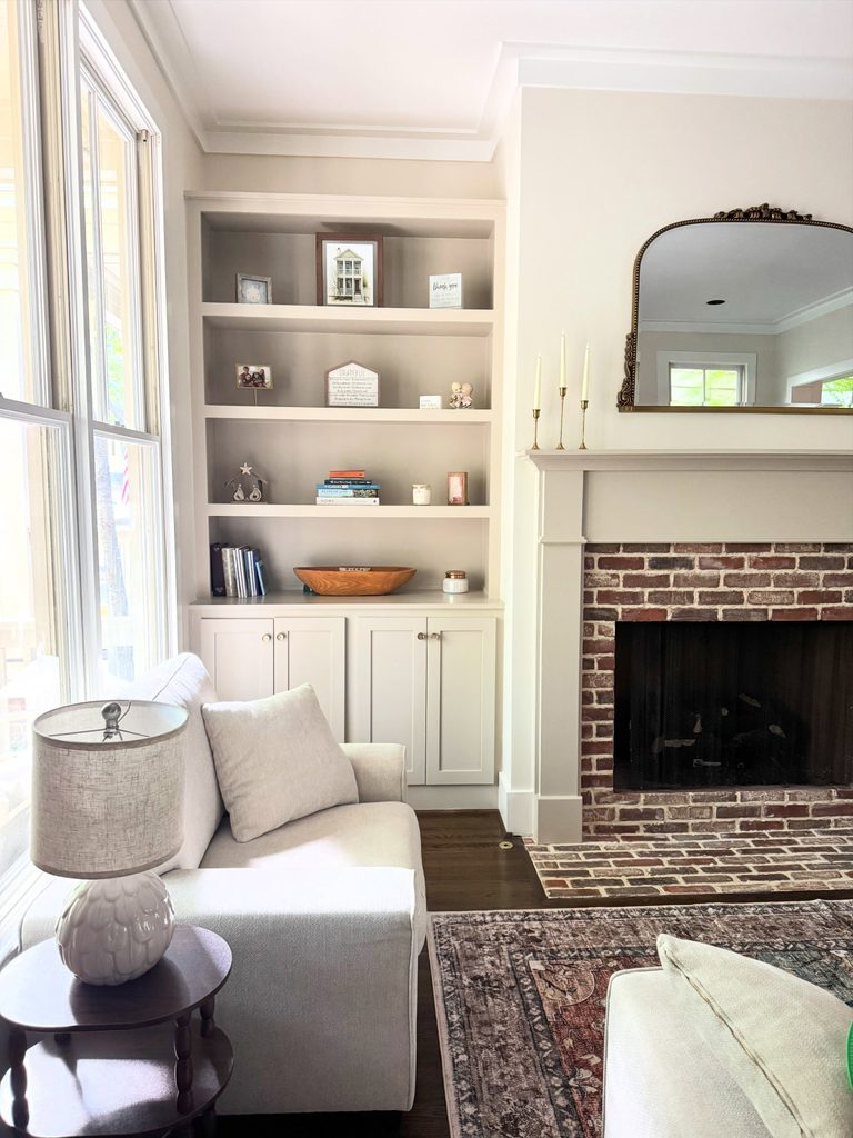
Sherwin-Williams White Duck is a soft, warm off-white that creates an understated and sophisticated backdrop. Sitting between a creamy white and a light greige, it has subtle beige and gray undertones that give it more depth than a crisp white. SW White Duck works beautifully in living rooms, bedrooms, kitchens, dining rooms, and even open-concept spaces.
It pairs especially well with natural wood, warm metals, stone, linen, and earthy neutrals. In bright natural light, it can feel light and airy, while lower light brings out its warmer, slightly creamy character. If you’re looking for a creamier off-white that makes a home look welcoming, organic, and expensive, SW White Duck is a versatile choice for a ‘whole house color’.
Sherwin Williams Iron Ore
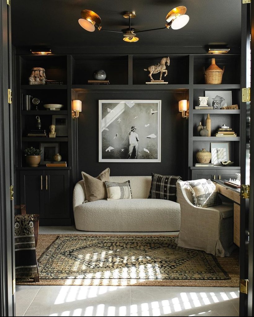
Sherwin-Williams Iron Ore is a deep, sophisticated charcoal that brings instant depth and a sense of moody character to a space. While it is a soft black color, the undertones make it feel more refined and versatile than a true black. SW Iron Ore looks timeless on the interior doors, kitchen cabinets, built-ins, fireplaces, accent walls, and millwork. Yes, it works beautifully in spaces where it can create a contrast against lighter walls.
You must pair SW Iron Ore with warm whites, natural wood, marble, brass, leather, and soft neutral fabrics for a layered and sophisticated look. In brighter spaces, it can read as a deep charcoal, while lower light makes it appear richer and moodier. If you’re looking for a dramatic paint color that adds depth and a designer feel to your home, Sherwin-Williams Iron Ore is a striking choice.
Sherwin Williams Cyberspace
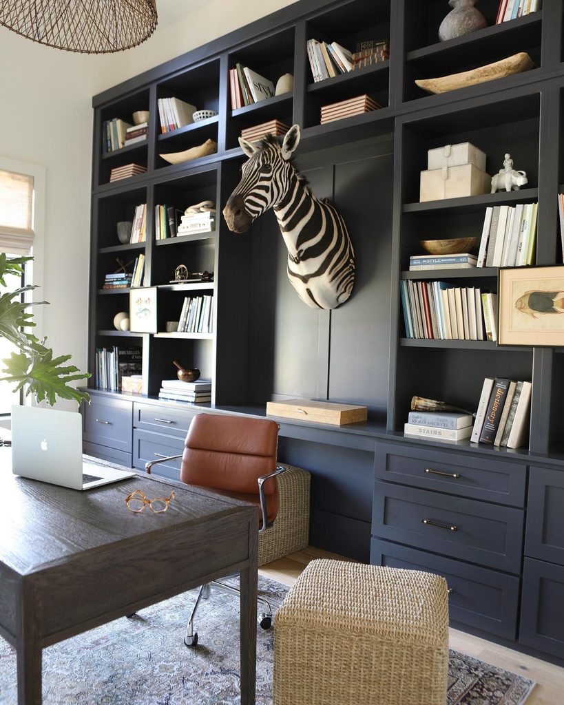
Sherwin-Williams Cyberspace is a deep, moody blue-gray that adds sophistication and drama without feeling as harsh as a true black. Its complex blend of blue and gray gives it a refined, contemporary character that works beautifully in spaces where you want depth and contrast.
Cyberspace is particularly striking on kitchen cabinets, bathroom vanities, built-ins, interior doors, accent walls, and home offices. It pairs beautifully with warm whites, natural wood, brass, marble, and soft neutral fabrics. Depending on the lighting, Cyberspace can appear more blue-gray in brighter conditions and significantly deeper and moodier in low light.
If you’re looking for a rich, sophisticated paint color that gives a room a custom, designer feel, Sherwin-Williams Cyberspace is an excellent choice.
Sherwin Williams Evergreen Fog
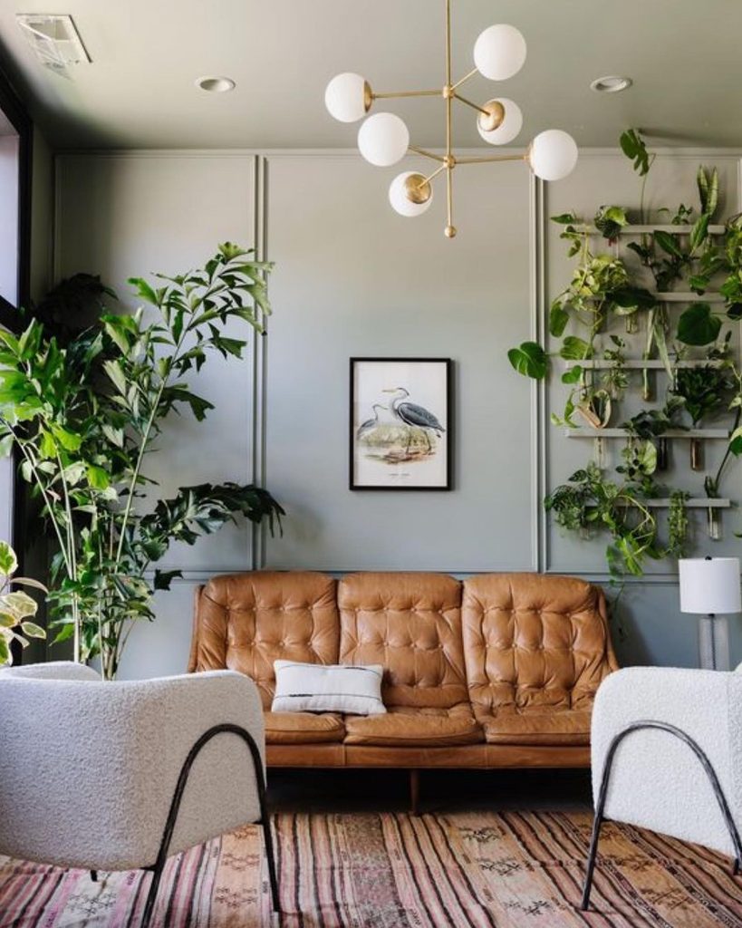
Sherwin-Williams Evergreen Fog is a sophisticated, muted green with subtle gray undertones that brings a calm and refined vibe to your space. The earthy and muted character makes it feel timeless rather than overly trendy. Hence, making it especially beautiful in spaces where you crave an inside-out feel!
SW Evergreen Fog works beautifully on bedroom walls, kitchen cabinets, bathroom vanities, built-ins, and accent areas. It pairs effortlessly with warm whites, natural oak, walnut, brass, stone, linen, and other earthy neutrals. However, you must choose to color-drench a room in SW Evergreen Fog for the ultimate sophisticated look.
If you’re looking for a nature-inspired paint color that adds sophistication, warmth, and character, Sherwin-Williams Evergreen Fog is a beautiful choice.
Benjamin Moore Cinnamon Slate
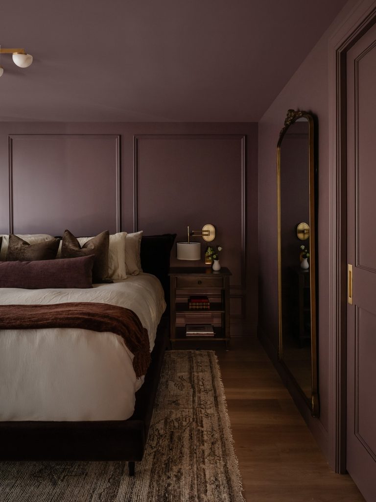
Benjamin Moore Cinnamon Slate is a rich, sophisticated shade that combines the warmth of cinnamon with the depth of a muted plum. Its complex undertones give it a cozy and luxurious feel, making it a beautiful choice for interiors where you want to create depth and character.
BM Cinnamon Slate works particularly well in moody home offices and color-drenched bedrooms or dining rooms. It pairs beautifully with warm whites, creamy neutrals, natural wood, brass, aged metals, and soft textiles. Depending on the lighting, it can appear warmer and more brown or reveal its subtle plum character.
If you’re looking for a rich and dramatic color to break the monotony of creams and beiges in your home, Benjamin Moore Cinnamon Slate is a distinctive choice.
Benjamin Moore Collingwood
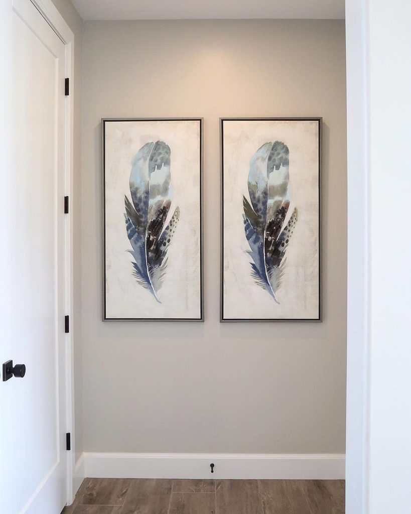
Benjamin Moore Collingwood is a soft, sophisticated greige that creates an elegant and calming backdrop without feeling cold or stark gray. The balanced mix of gray and beige gives it a sense of versatility that works beautifully across a variety of interior design styles. BM Collingwood is particularly well suited to living rooms, bedrooms, dining rooms, hallways, and open-concept spaces.
It pairs beautifully with warm or neutral whites, white oak wood, soft beige, black accents, brass, stone, and layered neutral fabrics. So, if you’re looking for a refined and balanced greige that makes a home feel sophisticated, cohesive, and timeless, Benjamin Moore Collingwood is an excellent choice.
Benjamin Moore Kendall Charcoal
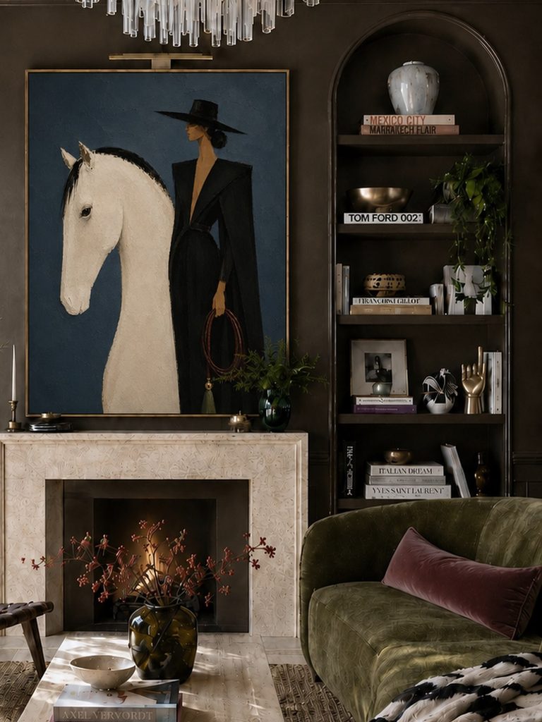
Benjamin Moore Kendall Charcoal is a deep, sophisticated charcoal gray that brings instant depth and elegance to a space. The warm undertones make it a beautiful choice for creating a dramatic, earthy yet inviting atmosphere. BM Kendall Charcoal works particularly well on accent walls, kitchen cabinetry, built-ins, fireplaces, interior doors, and dining rooms.
Pair it with warm whites, creamy neutrals, natural wood, dark wood stains, brass, leather, marble, and soft textiles to create a layered and luxurious look. In bright natural light, Kendall Charcoal can appear softer and more gray, while lower light emphasizes its rich, moody character. If you’re looking for a dark and moody paint color but not black, Benjamin Moore Kendall Charcoal is a timeless option.
Benjamin Moore Swiss Coffee
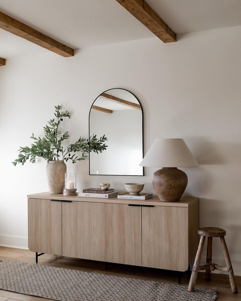
Benjamin Moore Swiss Coffee is a warm, creamy off-white that creates an elegant and inviting backdrop. Its soft warmth makes it feel more sophisticated and welcoming than a stark white, while still keeping a room feeling light and airy. BM Swiss Coffee works beautifully in living rooms, bedrooms, kitchens, dining rooms, and open-concept spaces, making it a versatile choice for walls, trims, and cabinetry.
It pairs especially well with natural wood, warm beige, taupe, black accents, brass, stone, and soft neutral textiles. Depending on the lighting and surrounding finishes, BM Swiss Coffee can appear light and creamy or slightly warmer and richer. If you’re looking for a timeless warm white that gives a home a polished, elevated feel, Benjamin Moore Swiss Coffee is a beautiful choice.
Benjamin Moore Saybrook Sage
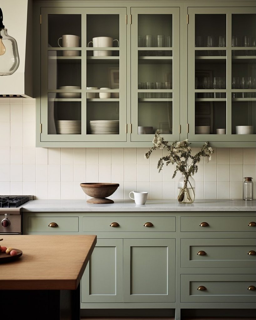
Benjamin Moore Saybrook Sage is a soft, muted green with subtle gray undertones that brings an earthy, sophisticated touch to a space. The gentle, desaturated appearance makes it an elegant alternative to brighter greens, while the muted and subdued character creates a calm and welcoming atmosphere.
BM Saybrook Sage works beautifully in living rooms, bedrooms, bathrooms, kitchens, home offices, and cabinetry. It pairs especially well with warm whites, creamy neutrals, natural wood, brass, stone, and woven textures. I love the look of a color-drenched space as well!
If you’re looking for a refined, nature-inspired paint color that adds depth without overwhelming a space, Benjamin Moore Saybrook Sage is a beautiful choice.
Benjamin Moore Pashmina
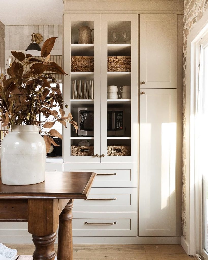
Benjamin Moore Pashmina is a rich, sophisticated greige that blends warm beige with gray to create a beautifully grounded neutral. It has noticeably more depth than many popular light greiges, giving your space a warm, tailored, and luxurious feel without being overly dark.
BM Pashmina works beautifully in living rooms, bedrooms, dining rooms, home offices, cabinetry, and accent spaces. Pair it with creamy whites, natural wood, stone, brass, black accents, and layered neutral textiles for an elegant, designer-inspired look. Depending on the lighting and surrounding finishes, BM Pashmina can appear warmer and more beige!
If you’re looking for a rich neutral paint color that can make your home feel sophisticated and expensive, Benjamin Moore Pashmina is a timeless choice.
Final Word – 12 Paint Colors That Make a Home Look Expensive
The right paint color can make a remarkable difference in how expensive, sophisticated, and thoughtfully designed your home feels. From timeless warm whites like Sherwin-Williams Alabaster and Benjamin Moore Swiss Coffee to elegant neutrals like Accessible Beige, Collingwood, and Pashmina, these hues create a polished backdrop that allows your furniture, lighting, and architectural details to shine.
For a little more drama, deeper colors such as Sherwin-Williams Iron Ore and Cyberspace or Benjamin Moore Kendall Charcoal and Cinnamon Slate can add depth and create beautiful focal points. Muted shades like Evergreen Fog and Pewter Green bring an earthy, sophisticated quality while keeping the overall look refined.
With a thoughtfully chosen color palette and well-coordinated finishes, you can create a home that feels elevated, timeless, and beautifully designed—regardless of your budget.