Hola everyone! I am back here with another color consultation blog! I am often asked a simple question – “How to choose a color palette for homes?”
Well, know it – there is a difference between ‘creating’ and ‘choosing’ a color palette.
If you haven’t checked out my last post, click here to read more about how to create a color palette for your home!
Well, wait! Doesn’t that sound like something I am going to be writing right now?
Yes, I know you’ve got those confusing looks and that’s why I chose to write another blog here!
In my last post, I explained more about how to ‘create’ a color palette in an already existing space with underlying color schemes and interior elements!
However, when it comes to ‘choosing’ a color palette, it is totally expected to start from scratch!
Maybe you are moving into a brand-new home? Or planning to live in a space with no pre-existing interior elements?
Well! This is the post for you!
I am constantly asked about how to choose a color palette for homes!
Do you ever wonder how to go about a bare white box of concrete which you call your living room or bedroom?
This is the time to think afresh!
How to Choose a Color Palette
Step 1: Let the Color Wheel play its Magic

A color wheel is composed of primary, secondary, and tertiary colors!
- Primary colors are red, blue, and yellow that is the purest and can’t be created.
- Secondary colors are orange, green, and purple. These are created by blending two primary colors. For example, red and blue make purple, blue, and yellow make green, and red and yellow make orange!
- Tertiary colors are a mixture of primary and secondary colors to create different hues and their corresponding shades.
Aware of tints, shades, and tones?
Well, I am going to be using a lot of these terms for my future blog posts so let me tell you the differences between each one of them!
- Tints – Simply add ‘whites’ to your pure colors to create a perfect tint! They are basically pastels with soft and subtle backgrounds. When working in the computer world, you basically just have to adjust the opacity and you’re good!
- Tones – Tones are basically the addition of greys to the pure color! You can simply ‘tone-up’ or ‘tone-down’ your palette as per the requirement!
- Shades – Quite commonly used, shades are basically produced by adding blacks to any pure color! Ranging from medium to dark colors, these shades are a great addition to your interior space
Step 2: Choose a Color Scheme
Now that you have a wide plethora of colors and their tints, tones, and shades – it is time to pick a color scheme.
Depending on your design style and personality, you get to choose one of the following schemes!
-
Monochromatic
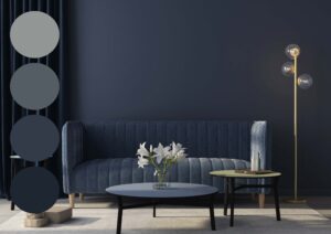
Monochromes usually blend in well with the Scandinavian and Minimalist designs. It basically uses tones of one color and the addition of black and white to this pure color. For example, using the same shade as sky blue, blue, and then midnight blue all in one place!
This is personally one of my favorite schemes as you get to see how one particular color plays the magic! However, no matter how sophisticated and elegant the monochromes look, it is very important to accurately design such spaces to create the perfect outcome!
-
Analogous
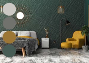
Look closer at the color wheel! Through this scheme, you get to choose the colors sitting next to each other. For example, blue can be used with green or purple, and yellow with green or orange!
-
Contrast
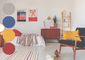
This color scheme is comparatively more dramatic! By introducing more than one contrast, basically three in this case – just like a triad of contrasting colors. For example, using orange, purple, and green will best create a triadic palette, or else choose blue, red, and yellow like shown in the picture above.
-
Complementary
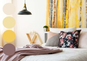
To create a subtle yet dramatic effect, a complementary color scheme is used that uses two colors sitting opposite on the color wheel. For example, purple and yellow, and red and green.
All these color schemes have their own magic to play in your homes!
-
Split Complementary
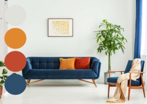
One of the most interesting schemes, this color palette uses two colors adjacent to its complementary shade! This scheme touches upon drama and depth in your space. It is used to add pops of colors to your space while creating a strong visual connection.
How to Choose a Color Palette – Step 3: Use the 60-30-10 Color Rule
Now that you have a set of chosen colors and schemes, you need to know how to really play with them!
And this is the GAME I love to play!
The 60-30-10 is an interior decoration rule that helps in creating a color palette for your space!
(Don’t confuse it with the Accent rule discussed in the previous post)!
Also, this rule has really helped me in creating a perfect palette for my Interior Decoration projects!
So, what is 60%?
This will hold the dominant color from the scheme, mainly in the form of walls, sofas, armchairs, accent pieces, rugs, and other major elements.
Followed by 30%
That is –
Secondary color from the scheme mainly in the form of curtains and ottomans!
The story is still not over!
Last but not the least, 10% is the accent that mainly is characterized through artwork, vases, throw pillows and blankets, flowers, and accessories!
Well, not that difficult, right?
So, do you have your color palette ready?
Well, before I conclude, there are a few other color factors that I want to acquaint you with!
Important Color Terms
You might have noticed me using terms like ‘cool colors’ and ‘warm colors’! What are they?
Well, all these colors have their story to tell!
And trust me on this, the colors too hold a lot of potential in transforming the aura and creating a desirable mood for your space!
So, let’s get started with warm and cool colors.
Warm Colors are reds, oranges, and yellows that tend to dominate and stand out to make the rooms feel warmer! Now, based on this information, you can use this color on the walls depending on the natural light received in the room and your existing interior elements!
On the other hand, cooler colors are blues, greens, and purples that help in creating a calm atmosphere. These colors are also responsible for making small rooms look spacious!
Don’t worry!
I have specific blogs for that as well!
So, are you enthralled to choose a color palette for your dream home?
By now, I am sure it must be much simpler for you!
Let me know your experiences in the comments below or check out my interior decoration and color consulting packages where I can get one-on-one with you and we can discuss your spaces and choose a perfect color palette depending on your lifestyle and preferences!
Can’t wait to hear from you guys!
Until next time,






Really informative and so easy to understand. It’s really helpful as I have taken a new place and planning to style it up from the scratch.
Hi Pallabi, All the best for the new venture!! Do let me know if you have any questions 🙂