2020 has been a rollercoaster for all of us! Isn’t it? Well, this upcoming year is no lesser – except we have learned from our pasts! It is definitely a given that we have discovered our love for nature while spending most of the time indoors.
And every canceled trip gradually made us realize that we needed utmost transformation in our homes to feel more inspired and comfortable to live, work, and play.
From futuristic retro hues in 2019 to more subtle and soothing shades in 2021, color trends for this year definitely desire peace and serenity. The beauty of earthy tones, natural greens, ocean-inspired blues, and subtle neutrals are making headlines as the color trends for the year 2021.
Taking inspiration from nature’s own hues, these trends are bound to add a softer and cozy touch to your homes. A lot of muted and bold tones are overplaying the game as well. Want to see them closer? Let’s discuss the 5 top color trends for 2021.
Color Trends 2021
1. Sage Green
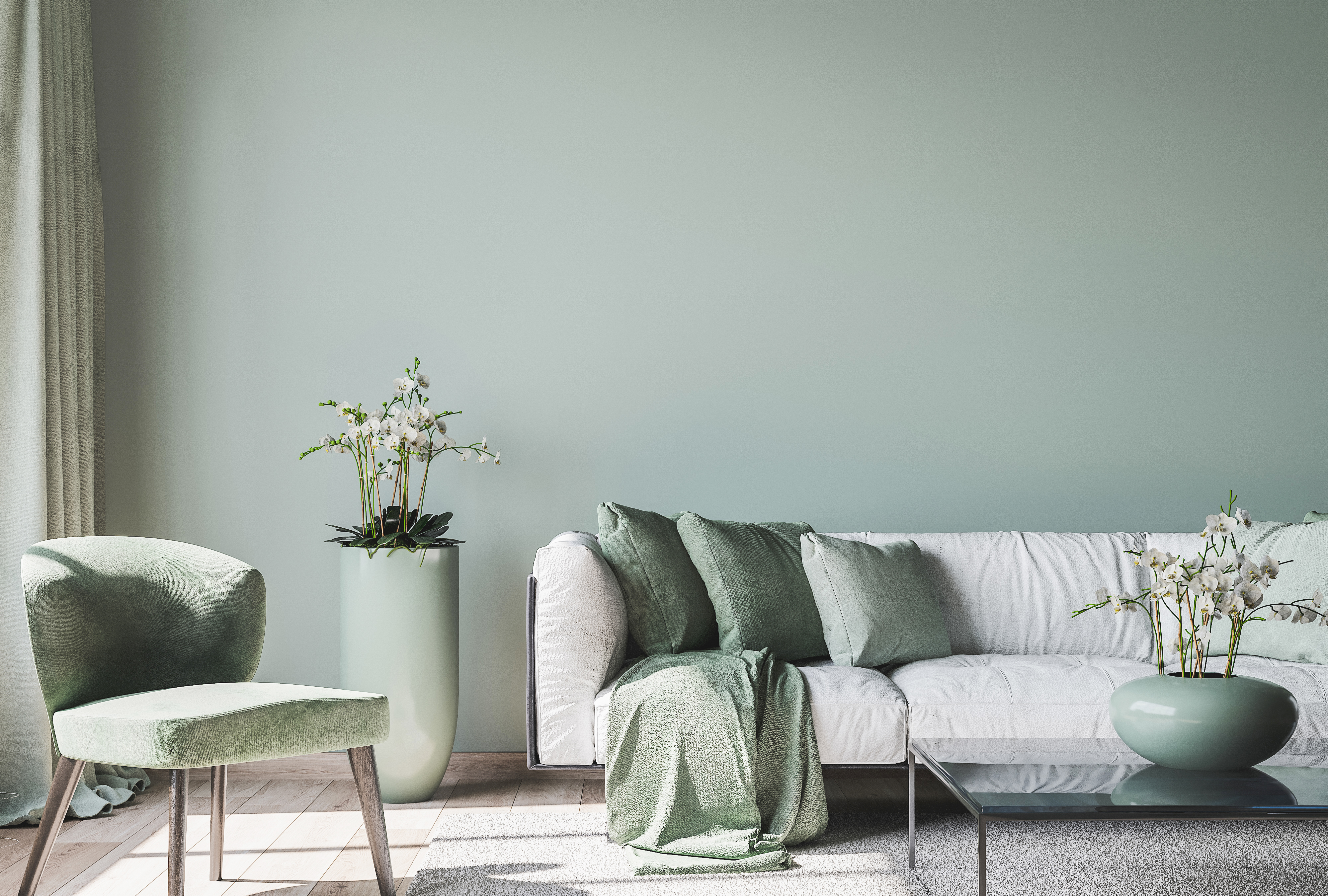
A pastel green, Sage green is a perfect blend of greens and grays. It is soothing and tranquilizing while very beautifully mimicking the shades of nature! I must say, this tone is being used tremendously in the home décor industry – and it is also one of my absolute favorites.
If you have a minimalist or a modern style, you can either try monochromatic shades or simply use this paint on the accent walls. Kitchen cabinetry and bedroom focal wall would be the best places to add a tint of sage green.
So, do you know where the color takes inspiration from? Well, a culinary herb that has woody stems and grayish leaves. As a subtle green, this color exhibits a feeling of peace and growth while complementing the shades of whites, golden tints, and beiges.
Check out this sage green moodboard where I have tried to blend the golden tints and wooden textures with neutral hues. Drop me a message if you like it!
2. Terracotta
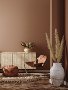
The warm-toned orange and brown color very exotically mimic the earthy shades of clay-like earthenware ceramic that could be glazed or unglazed. I personally love the beauty of this color and the absolute feel of a warm and welcoming environment. Does this color remind you of a specific place? To me, it reminds the reds of Morocco!
You can blend in some golden jewels, matte blacks, and deep blues to create an interesting contrasting effect. Moreover, if you plan to choose monochromatic shades – your space is going to absolutely look classic and timeless (like the image above).
There are two kinds of terracotta – orange-pink and brown-pink. Although I love the latter, but you can absolutely play around with the oranges as well. If you have a bohemian style, this paint color is absolutely good to go!
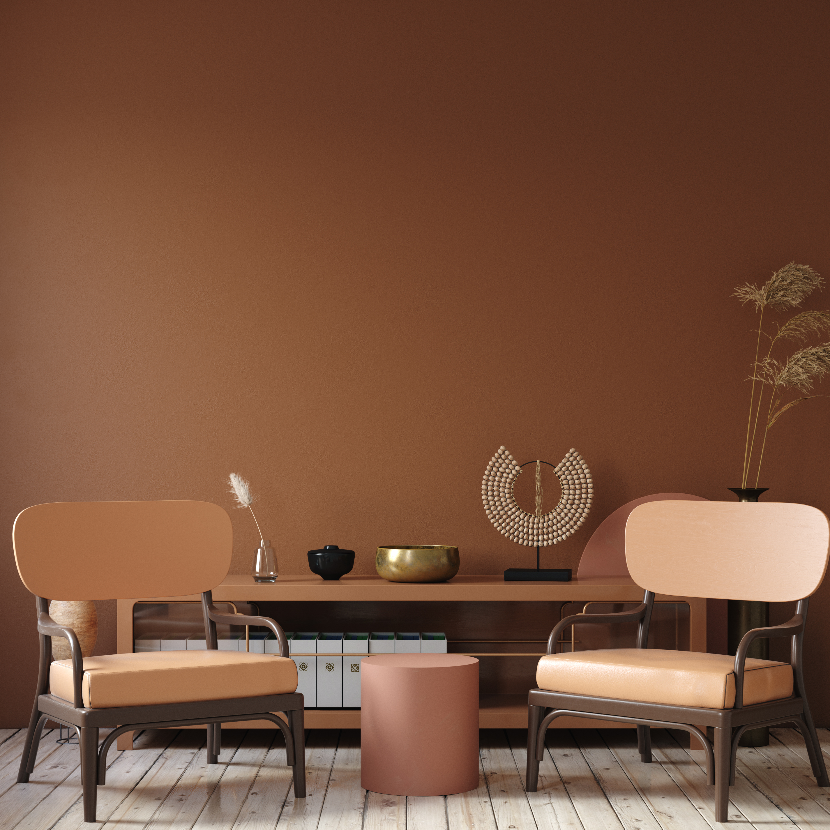
Check out the blending of oranges with pink in the picture above. You can also add touches of golden tints and wooden textures along with some pampas grass to add a natural vibe to your spaces.
3. Ultimate Grey + Illuminating – Pantone Color Trend 2021
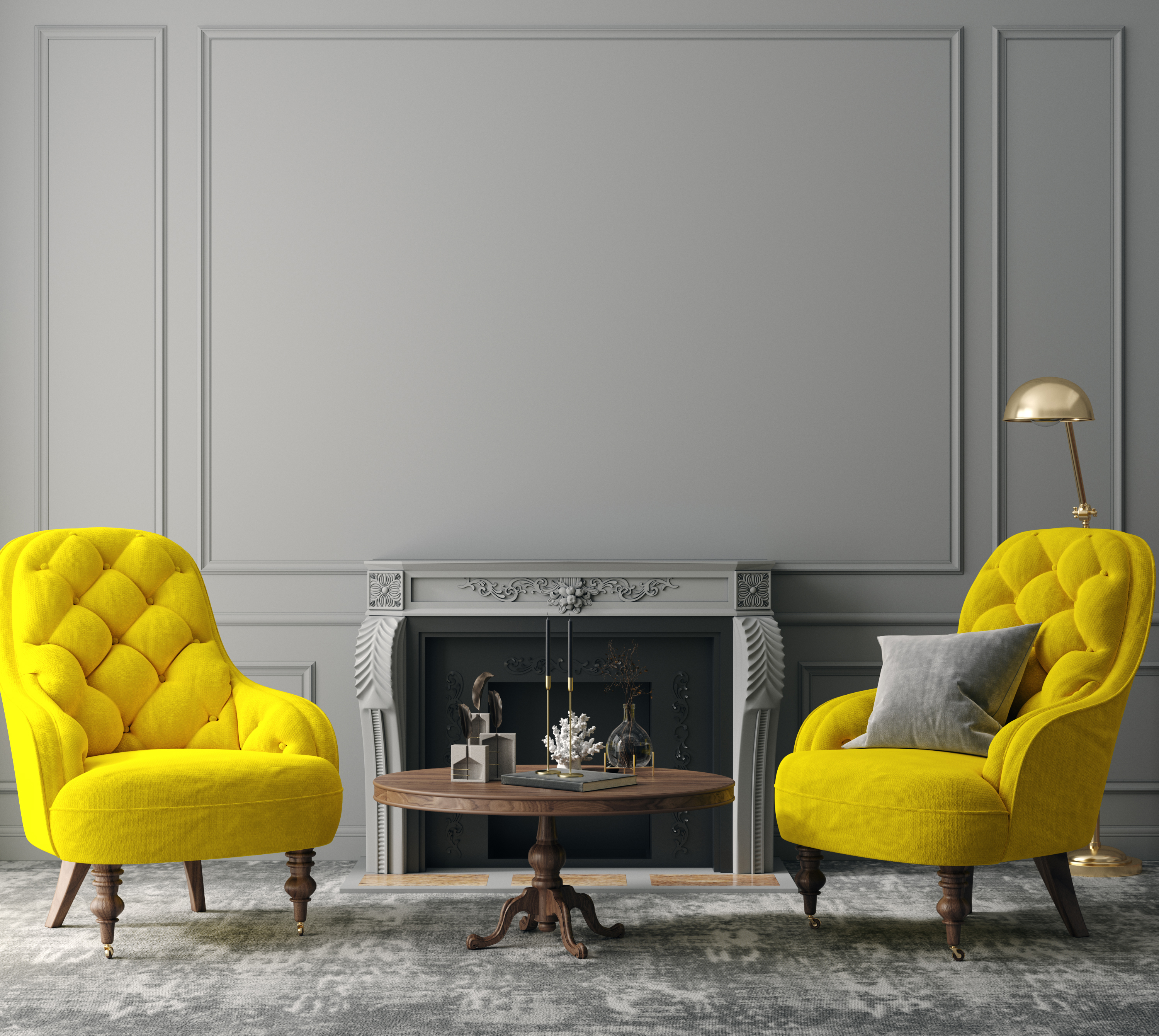
The color of optimism, strength, and hopefulness, Pantone’s Ultimate Grey and Illuminating is quite a trend this year. A perfect union of two colors poles-apart, this color palette is definitely worth a shot. But do you know what the color is truly indicating? Well, simply a ray of hope and a much brighter future to come!
Monochromatic shades of grays and black amalgamating with yellows in itself can create a perfect contrasting color palette. And you would be surprised to know that not just the interior design industry but even the furniture, fashion, and automobile industries are majorly opting to consider these hues in their upcoming designs.
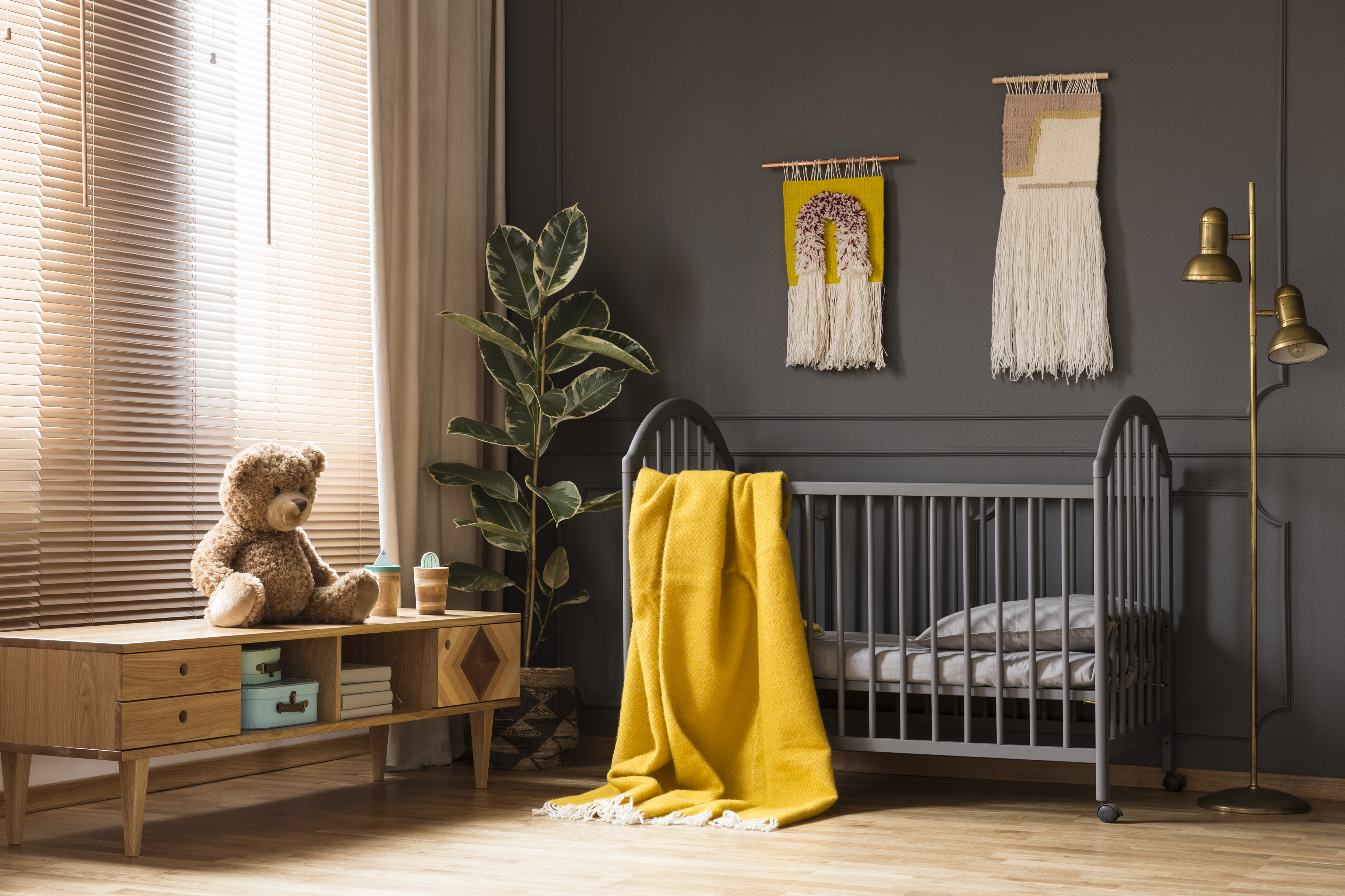
“No one color could get across the meaning of the moment,” Laurie Pressman, the vice president of the Pantone Color Institute, said on a call. “We all realized we cannot do this alone. We all have a deeper understanding of how we need each other and emotional support and hope.”
4. Sakura Pink
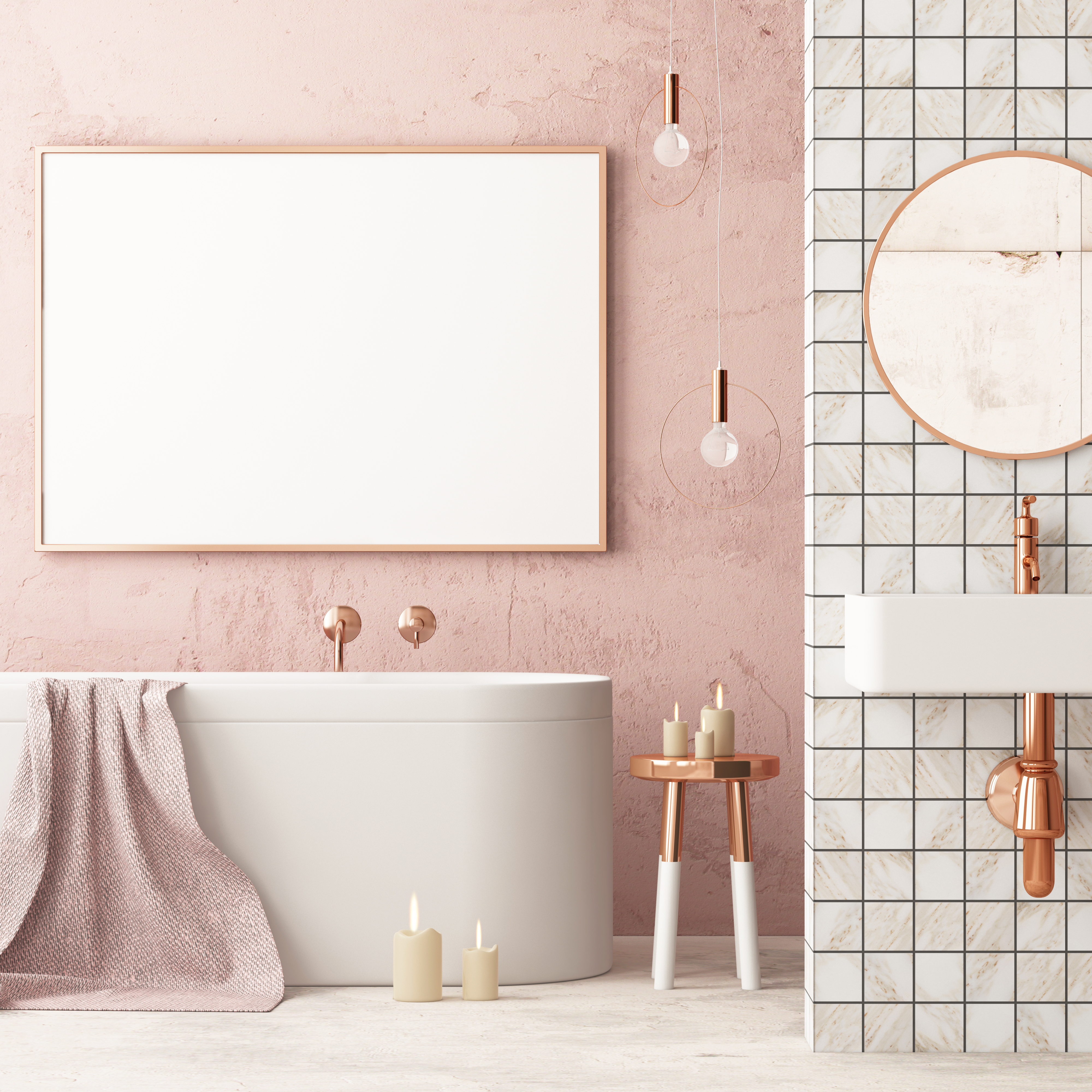
Sakura Pink is the new black! This warmer hue has a tinge of a feminine and romantic touch – but who cares, right? Because the color is simply flawless! You can either use it as a neutral backdrop or various accents throughout the space. The subtle and soothing effect of the color has the magic to brighten your home interiors.

This color is basically formed when you blend the pinks and Sakura pinks with the shades of gray. However, don’t confuse this color with the Barbie pink or baby pink – this is quite a unique and everlasting trending shade. You can best pair it with teal greens, rose-gold or gold metal tints, beiges, off-whites, and blues.
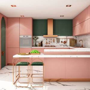
Remember the ‘Nude’ trend of 2011 – yes, that is what this color takes inspiration from. It’s a nostalgic mix of comfort and aesthetics – keeping in mind the derived hues from nature. Just a tint of this trendy color will add an inviting and cozy feel to your interior spaces.
5. Aegean Teal – Benjamin Moore Color Trend 2021
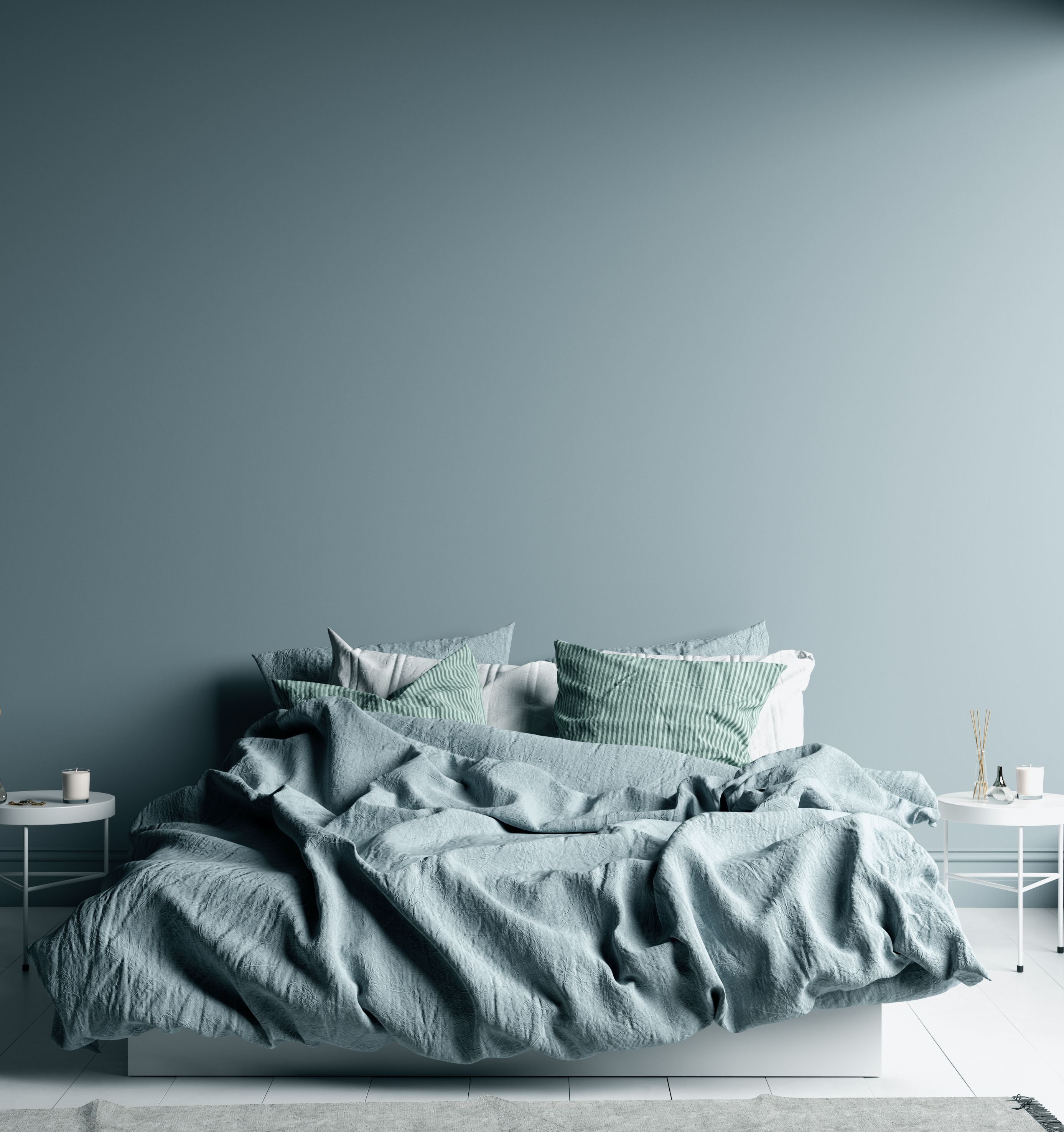
Balanced and intriguing, this soothing teal paint color is one of the limelight in the year 2021. This beautiful color exhibits a touch of natural harmony and nature in one of the most exciting ways. I recommend complementing the color with mustards, golden tints, and even wine and purple.
This beautiful Benjamin Moore paint promises a positive and enlightening future for the homeowners. And not only the aesthetics but also focusing on the health and well-being of the users. This paint color is bound to add a touch of creativity and a ‘homey’ feel in your spaces – so, undoubtedly this color tops the list of color trends for the year 2021.
Last but not the least, you can cohesively incorporate wooden textures and metal tints with this backdrop! I promise a bold and authentic look the color would bring to your spaces.
So, are you excited to incorporate any of the color trends in your homes? Well, do let me know your thoughts and experiences in the comments below as I would LOVE to know more about it!


