
This article is dedicated to discussing the best Sherwin Williams paint colors for the North-facing rooms. I have handpicked 10 best neutral paint color ideas that will work effortlessly in the north-facing room. Well, in general, picking the best wall color for a north-facing room can be quite easy! The incoming natural light is cool blue/gray and the shadows are constant. Hence, pick warmer tones with a considerable depth and undertone to go! Also, avoid the blue or gray undertones here.
Since the north direction is deprived of direct sunlight – it feels chilly and cold due to the lack of warm sun rays and the only natural light that is being received has a touch of blue-grey in it! So, you are not going to benefit from the warm visual appearance that nature gives! Instead, you are blessed with a ‘cool’ light! But does that give you a reason to let your guard down?
Absolutely, NO! I have got your backs – and I have super advice for you if your room faces north!
North-Facing Light and Paint Colors
So, have you ever felt chilly when you entered a specific room in your home and wondered what was wrong with the room and why it felt so uncomfortable? That room might have all your favorite finishes, furniture pieces, as well as a rug, some throw pillows, and appropriate lighting – but it still somehow feels incomplete! Well, yes – I hear that a lot, and that is due to the direction that your room faces – NORTH!
North-facing rooms get consistent blue-grey light throughout the day – so you can pretty much choose any paint color and not worry about it appearing like another hue. Depending on the amount of light received, whether too much or too-less, you can determine the darkness or brightness of the paint color. Remember, even with too much light – that sense of ‘warmth’ is lacking! So, it’s highly recommended that your north-facing room receives ample natural light so it doesn’t look dull or dingy with the incoming cool light.
Look around for warmer palettes that are going to balance the ‘cool’ natural light with its utmost creaminess and warmth! Another way to introduce warmth is by incorporating warm-yellow or cool-yellow recessed lights and pendant lights.
- Choose Warm Whites, Creams, Warm Gray/Greige, Khaki, Warm Green, Tan, Taupe, or Warm Beige
- Avoid Cool Grays and Blues, Cool Greens, Mint Greens, and Cool Whites with Gray, Blue, Green, or Purple undertones
- Avoid Stark White paint colors
- Warm pastels such as warm peach, pink, yellow, blue-green, and plum may work in a north-facing room
Two Types of North-Facing Rooms
-
North-Facing Rooms with Little Natural Light
North-facing rooms with little natural light can feel quite dingy and dull. So, it’s important that you choose brighter warm whites such as Sherwin Williams Greek Villa and Sherwin Williams Westhighland White. Avoid LRVs lower than 70! Avoid gray, green, blue, and purple undertones! Choose lighter and warmer colors for a north-facing room with little natural light.
-
North-Facing Rooms with Ample Natural Light
A bright north-facing room can always feel muted, subdued, but not glowy or lively! Of course, due to the lack of the sunrays. Hence, here’s why you can choose to go slightly darker (LRVs not below 50). Ideally, you can choose Sherwin Williams Shiitake and Sherwin Williams Navajo White. These are medium-toned, off-white colors with a notable yellow or warm beige undertone to brighten the north-facing rooms.
Have a look at these few paint color recommendations from Sherwin Williams that make a great fit for “North-Facing Rooms”!
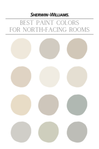
10 Best Sherwin Williams Paint Colors for North-Facing Rooms
-
Sherwin Williams Creamy
Sherwin Williams Creamy is a warm off-white paint color with just a touch of yellow undertones. With an LRV of 81, this off-white neutral is bright, warm, and has considerable depth and undertones. I would highly recommend this paint color for your north-facing rooms as it is definitely going to exhibit a sense of warmth and welcomeness!
The incoming cool natural light will neutralize with the ‘yellow’ undertones – hence, offering a neutral to slightly warm yellow appeal. In a north-facing room with little natural light, the yellow undertone can play dominant. On the other hand, in a well-lit north-facing room, this off-white neutral will come off creamy.
-
Sherwin Williams Agreeable Gray
Sherwin Williams Agreeable Gray is a warm and soft greige paint color with a major inclination for beige than gray. This timeless and classic neutral paint color will work wonderfully in a brightly-lit north-facing room. Even with the incoming cool natural light, SW Agreeable Gray will most likely appear neutral to slightly warm with the existing taupe undertones.
Sherwin Williams Agreeable Gray has an LRV of 60 – hence, can beautifully retain the depth and undertone without getting washed away.
Check out my FULL Paint Color Review Here – Sherwin Williams Agreeable Gray!
-
Sherwin Williams Accessible Beige
Sherwin Williams Accessible Beige is a soft and warm beige paint color with just a touch of gray undertones. This is an earthy and organic, cozy and comfortable beige color that will work beautifully in the north-facing rooms. The rich undertones will not be washed off and the warmth of this color will definitely be retained.
The cool incoming natural light will slightly ‘calm down’ the undertones of Accessible Beige while still exhibiting a warm appeal. With the LRV of 58, expect this color to look fresh and ‘organic’ in a well-lit north-facing room.
Check out my FULL Paint Color Review Here – Sherwin Williams Accessible Beige!
-
Sherwin Williams Natural Linen
Sherwin Williams Natural Linen is an overly warm-toned beige paint color with a notable orange undertone. This particular beige paint color has more ‘chroma’ than gray to it – hence, won’t wash off the undertones. Well, Natural Linen has an LRV of 66 – hence, making your north-facing room look light, airy, and definitely traditional.
But you need not worry about the ‘orange’ or ‘golden’ undertone since they’re quite likely to neutralize with the incoming cool light. In a north-facing room with little natural light – try opting for much brighter and lighter options to go!
-
Sherwin Williams Greek Villa
Sherwin Williams Greek Villa is a creamy and bright off-white paint color with the perfect touch of warmth. Well, this is definitely one of the best paint colors for a north-facing room – especially, if you have little incoming natural light and the square footage is less. SW Greek Villa has an LRV of 84 – hence, a great choice to brighten up the dull north-facing corners.
This is one of the best-selling paint colors by Sherwin Williams and can also be used as a whole house color scheme!
Check out my FULL Paint Color Review Here – Sherwin Williams Greek Villa!
-
Sherwin Williams White Duck
The timeless, classic, and modern organic – Sherwin Williams White Duck is a beautiful warm-toned, off-white paint color with the perfect ‘greige’ undertone. It’s neither too light nor too dark – hence, can effortlessly accommodate the depth of the incoming cool natural light. With an LRV of 74, this color will beautifully contrast with the white trims and ceilings and also offer a luxe appeal. This color works well for medium-sized north-facing rooms with considerable incoming natural light.
If you have a small north-facing room with little incoming natural light – prefer choosing Sherwin Williams Greek Villa or Sherwin Williams Alabaster over Sherwin Williams White Duck.
-
Sherwin Williams Antique White
Sherwin Williams Antique White is a rich and traditional, dark off-white paint color with a notable yellow and beige undertone. This paint color will profoundly hold its undertone in the north-facing room without making it look cold or icy during the day. Especially if you reside in a colder region, this paint color is quite ideal for the north-facing room.
With an LRV of 72, SW Antique White will work well in a brightly lit north-facing room. Moreover, this color will also work in traditional 2000’s homes and homes with dark hardwood flooring.
-
Sherwin Williams Worldly Gray
Sherwin Williams Worldly Gray is a sophisticated warm gray paint color with slightly more warmth than Sherwin Williams Agreeable Gray. This classic neutral can make your north-facing room look lively, earthy, organic, and modern. And since it has an LRV of 57 – this neutral will work effortlessly in a medium or larger-sized north-facing room with ample natural light.
This color may also reflect a touch of green undertone – well, not very dominant though! You can pair this neutral with warm wood tones, soft white trim, and some black accents to go!
-
Sherwin Williams Silvermist
Sherwin Williams Silvermist is a beachy, airy, and coastal blue, green, and gray blend paint color. This color will beautifully hold the rich undertone all day long – and meanwhile, wouldn’t look too icy cold as well. Yes, due to the existing green undertone – the color can come off as a beautiful not-too-cool and not-too-warm blue-green neutral.
With an LRV of 47, this color has considerable depth and will not look washed out! Expect this color to slightly incline to the ‘blue’ end of the scale.
-
Sherwin Williams On the Rocks
@My Uncommon Slice of Suburbia
Really fond of the gray paint colors in the north-facing room? Well, this is definitely one of the best gray paint colors for the north-facing rooms. Sherwin Williams On the Rocks is a versatile gray paint color that doesn’t feel too icy or frosty gray. It is definitely a bright gray or an off-white paint with considerable gray undertones. Especially for medium to larger-sized rooms with considerable incoming natural light – this paint color can be a total bliss!
With an LRV of 62, this color will retain its depth and undertone (even with shadows onboard).
So, excited to paint your north-facing room? Remember to choose warm and soft paint colors for your north-facing room to ensure warmth all year round, even during monsoons! Let me know your experiences in the comments below or have a look at my interior decoration and color consulting packages so we can get one-on-one and choose the best paint colors for north-facing rooms!


I have a burgundy carpet. Not my favorite but I can’t change right now and north facing room with 2 small windows. Any suggestions on color. One wall is open to dining room with south facing double glass doors so it does go some of that light.
Hi Cindy,
No worries! You can best make use of creamy whites and a tinge of mustard on the adjacent to feel the beauty of burgundy and at the same time, make your room feel cohesive and warm.