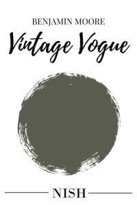
Benjamin Moore Vintage Vogue is a bold, moody, and dark sage green paint color with considerable warmth and gray undertones. So, if you’re looking for a dramatic and earthy, dark green paint color to make a dominant statement in your home – BM Vintage Vogue is definitely something to have an eye on. Regardless of the color palette and interior design style – this bold green color by Benjamin Moore is bound to work effortlessly. Whether you have a traditional or a modern touch in your home – accentuating with Vintage Vogue by Benjamin Moore can truly make an eclectic statement.
In this color review, I will be disclosing everything you need to know about Benjamin Moore Vintage Vogue. We’re going to discuss the undertones, Light Reflectance Values (LRVs), where and how to use this classic and bold green color in your home, color comparisons, FAQs, and much more! We will also discuss how this color behaves in various lighting conditions. And yes, I am going to showcase some real-time images as well! Excited much? Let’s get started!
What Color is Vintage Vogue by Benjamin Moore?
Vintage Vogue by Benjamin Moore is a rich and moody sage green paint color that can ideally play a great role in any home. Whether you’re looking to introduce nature indoors or simply add a touch of sophistication and elegance, this paint color is bound to work! The existing ‘warmth’ in this paint color can readily offer an earthy and organic statement. Meanwhile, the existing gray undertones can make the paint color feel slightly muted and not too bright and saturated. I personally love this green-gray paint color by Benjamin Moore as it also simply offers timelessness and extreme versatility.
Benjamin Moore Vintage Vogue must definitely be used in a space that receives ample incoming natural light. This earthy and dark sage green color is a perfect blend of ‘green’ and gray that creates the ultimate modern and traditional statement overall. There have also been certain times that I have used this sophisticated and classic Benjamin Moore dark green paint color for my various E-Design and Color Consultation clients. I’d recommend that you definitely choose this paint color as an accent in various areas of your home.
I’d recommend that you try this ready-to-order swatch in different rooms with different lighting conditions to determine how Benjamin Moore Vintage Vogue will truly feel in your home.
Click here to get a peel & stick sample of Benjamin Moore Vintage Vogue
Is Benjamin Moore Vintage Vogue a Warm or Cool Color?
BM Vintage Vogue can definitely appear slightly warm because of the deep sage and yellow undertones. However, it isn’t too warm either! In my books, BM Vintage Vogue falls on the medium end of the scale and is neither too warm nor too cool. Moreover, this is a no-fail solution and can work for both warm and cool-toned color palettes.
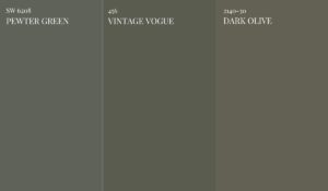
For instance, try placing a swatch of BM Vintage Vogue against BM Dark Olive and SW Pewter Green. You’ll observe how perfectly balanced BM Vintage Vogue appears. It’s not as warm and earthy as BM Dark Olive and neither too cool as SW Pewter Green. So, if you’re looking for a green-gray that has a hint of warmth without any muddy undertones – BM Vintage Vogue it is!
What is the Difference Between Benjamin Moore Dark Olive and Vintage Vogue?
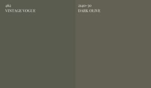
Benjamin Moore Dark Olive is a deep, rich, and moody sage green paint color with considerable muddy undertones. The dominant ‘brown’ and gray undertones can make this color feel quite earthy and organic. On the other hand, BM Vintage Vogue is clearly a dark green-gray paint color with the slightest hints of warmth to it!
What are the Undertones of Benjamin Moore Vintage Vogue?
Vintage Vogue by Benjamin Moore definitely has a slightly warm yellow undertone, but not very dominant though! This deep, rich, and moody green-gray color wouldn’t feel too warm or too cool – hence, offering the best of both worlds. This is also another reason why I’d like to recommend this paint color for both warm as well as cool-toned color palettes. Moreover, BM Vintage Vogue has the right amount of depth and ‘chroma’ and the gray undertone in this color takes the mainstage. So, regardless of the lighting conditions, it’s bound to feel less muted and slightly more chromatic.
However, I do recommend that you choose this color in a space that receives ample incoming natural light. With little or no incoming natural light – choose Vintage Vogue only as an accent on the vanity, cabinets, or the focal door. Another beautiful characteristic of the color is the fact that you need not worry about any sneaky undertones! It’s one of the best neutral and dark green-gray paint colors by Benjamin Moore. Let’s discuss how this color behaves in different lighting conditions –
- In the north-facing rooms, BM Vintage Vogue can feel more neutral with mainly the pops of ‘gray’ undertones playing a dominant role.
- In the south-facing rooms, the Vintage Vogue paint color can feel ‘chromatic’ and considerably refreshing and bright. The warmth in this color tends to pop out!
- In the east-facing rooms, BM Vintage Vogue color will appear balanced all day long – as long as you allow ample incoming natural light to enter!
- In the west-facing rooms, Vintage Vogue by Benjamin Moore can feel warm mainly during the afternoon and evening hours and quite muted in the early morning hours.
BM Vintage Vogue LRV
Light Reflectance Value or LRV is an important aspect to consider when choosing the best neutral paint color for your home. This value determines how light or dark the paint color is – on a scale of 0-100. Hence, the darker the paint color, the lower the LRV is!
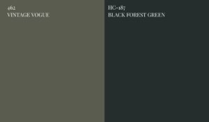
Benjamin Moore Vintage Vogue has an LRV of 11.85 – hence, falling on the darker end of the scale. It’s not too dark like other Benjamin Moore green colors that are almost near being ‘black’. Simultaneously, this color has considerable chroma to it and hence, can be classified as a dark green-gray paint color. For instance, try placing a swatch of BM Vintage Vogue against BM Black Forest Green and observe how dark the latter color appears. It’s almost black with considerable green undertones.
Can I Use Benjamin Moore Vintage Vogue For The WHOLE HOUSE?
Hell, no! Benjamin Moore Vintage Vogue is only ideal to be used in various areas of your home – as an accent! You must not overdo this paint color and simply use it everywhere! I’d only recommend that you stick to BM Vintage Vogue as an accent on the kitchen cabinets, mudroom cabinets, front doors, accent furniture, and maybe on all the walls of a well-lit home office or bedroom. Rather, I’d recommend that you choose this color only as an accent on the built-in shelves of your living room or family room or accent wainscoting in the kids’ rooms.
Just remember that you use Vintage Vogue color in spaces that receive ample incoming natural light. Whether you receive low or high incoming natural light – this color will always appear the same and you need not worry about any sneaky undertones. In the common spaces, try painting the living room built-in shelves with BM Vintage Vogue and further pair it with shades of cream, warm white, and light beige or greige for the surrounding walls.
How To Use BM Vintage Vogue Paint?
Vintage Vogue BM is a warm sage green-gray color that can be used in a particular space as well as on the cabinets, built-in shelves, and vanity. This color can be used on all the walls of a particular room, interior doors, the kitchen cabinets, mudroom and foyer cabinets, even exterior walls, bathroom vanity, wainscotting, and much more. Especially for interior design styles like Modern Mountain, Modern Classic, transitional, Modern Farmhouse, and Log Cabin – this dark sage green color by Benjamin Moore will work beautifully.
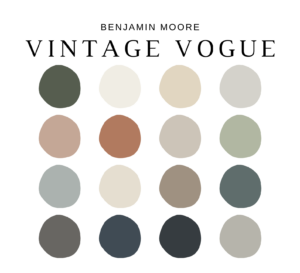
Here’s a well-curated pre-made color palette that I have created for BM Vintage Vogue on Etsy! It enlists all the exact colors that pair with Vintage Vogue color including how and where to use them in your whole house color palette. I have included 5 color palettes (with Benjamin Moore Vintage Vogue and complementary hues) along with how to use each of those paint colors in various areas of your home. You’ll also get the detailed MATERIAL and FABRIC palette with each of BM Vintage Vogue color palettes! Another bonus is PAINT PLANNER and a detailed guide on paint sheens for various areas of your home.
Here’s where you can download the palette – Benjamin Moore Vintage Vogue
Where To Use BM Vintage Vogue Paint in Your Home?
You can use Vintage Vogue by Benjamin Moore in various areas of your home. You can either use this color as an accent or base in a specific space or even on the doors, cabinets, vanity, and shelves. Moreover, this color is a classic choice for kids’ bedroom accent walls, home office walls, bedroom walls, laundry room cabinets and much more. Here’s where you can use this BM Vintage Vogue paint color –
- Front Door (Interiors and Exteriors)
- Exterior Walls
- Exterior Shutters
- Bedroom Walls
- Bathroom Vanity
- Laundry Cabinets
- Kitchen Cabinets
- Kitchen Island
- Built-in Shelves
- Wainscotting
- Mudroom Cabinets
- Foyer Cabinets
- Kids’ Bedroom
What Colors Go With BM Vintage Vogue?
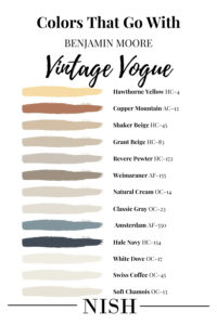
Colors that go with Benjamin Moore Vintage Vogue are shades of warm white, neutral whites, cool whites, clean whites, lighter sage greens, light blue-grays, light or dark warm grays, greige, beige, tan, taupe, khaki, black, mustard, rust, burnt orange, terracotta red, yellow, navy blue, and charcoal gray. Yes! This paint color is considerably easier to pair with other color categories.
Here’s a list of Benjamin Moore white colors that go with BM Vintage Vogue –
Now, here’s a list of Benjamin Moore soft blue colors that go with BM Vintage Vogue –
- Benjamin Moore Hale Navy
- Benjamin Moore Amsterdam
You must have a look at this list of Benjamin Moore gray and greige colors that go with BM Vintage Vogue –
- Benjamin Moore Classic Gray
- Benjamin Moore Natural Cream
- Benjamin Moore Weimaraner
- Benjamin Moore Revere Pewter
You must have a look at this list of Benjamin Moore beige colors that go with BM Vintage Vogue –
And lastly, here’s a list of Benjamin Moore rust and yellow colors that go with BM Vintage Vogue –
- Benjamin Moore Copper Mountain
- Benjamin Moore Hawthorne Yellow
What Trim Colors Go With BM Vintage Vogue?
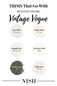
Vintage Vogue by Benjamin Moore must be used with either a warm white or a fresh and clean white trim for a sense of visual contrast. You can even choose bright warm white paint colors for the trims, moldings, and ceilings with this paint color.
Fond of the idea of color-drenching a room in BM Vintage Vogue? Well, you can definitely do that! As far as your space receives ample incoming natural light – you can definitely color drench and create a moody appeal. In a different sheen of course, for instance, choose Eggshell for the walls, semi-gloss for the trims, and matte or flat for the ceiling! Here’s a list of Benjamin Moore, Sherwin Williams, and Behr paint colors that can work as the ceiling and trim colors with BM Vintage Vogue.
- Sherwin Williams Pure White
I’d personally recommend SW Pure White trims, moldings, and ceilings to go with BM Vintage Vogue walls. Especially if you’re looking for a calm, clean, and seamless approach, this trim color is definitely to go! Pure White ceiling and Vintage Vogue walls will make a sophisticated contrast and can be used to make your home feel timeless.
- Benjamin Moore White Dove
Benjamin Moore White Dove is a classic choice for the trims, moldings, and ceiling with BM Vintage Vogue walls. Especially if you have a warm-toned color palette in your home – this color on the ceilings is bound to work effortlessly.
- Benjamin Moore Simply White
Another popular trim paint color choice for BM Vintage Vogue walls, choose BM Simply White. This is a clean and bright warm white paint color that can work phenomenally in any home.
- Benjamin Moore Chantilly Lace
BM Chantilly Lace is another clean and bright white paint that works wonderfully with Benjamin Moore Vintage Vogue paint color. In the case of contemporary, modern farmhouse, Scandinavian, and modern design styles – this trim color will never disappoint you and also create a visual contrast! Definitely one of the best trim colors to go with BM Vintage Vogue!
Where To Use Benjamin Moore Vintage Vogue in Your Homes?
As mentioned earlier, Vintage Vogue by Benjamin Moore can make a classic choice for any corner of your home. As far as you use the color as a base or an accent, it should be good to go! Well, if you’re excited to have a look at some inspirations of how this color has been used creatively, here’s a list to follow!
Benjamin Moore Vintage Vogue Living Room
Would you like to color-drench your living room or the family room in BM Vintage Vogue? Well, that will definitely create a rich, moody, and dramatic appeal. You can further choose to pick shades of taupe velvet and mustard as accents on the furniture. However, allow a considerable amount of natural light to enter this space!
Benjamin Moore Vintage Vogue Kitchen Cabinets
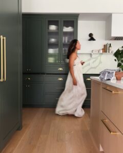
I personally love the look of BM Vintage Vogue on the kitchen cabinets! Moreover, it’s quite a classic and versatile green-gray color and can be used with the hardwood textures such as walnut, white oak, provincial, ebony, acacia, red oak, and golden oak.
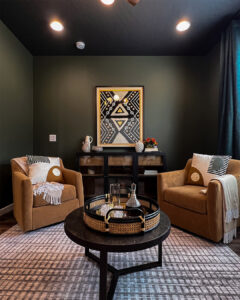
Vintage Vogue Home Office
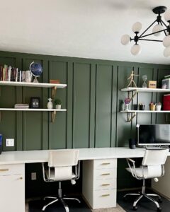
Every home office deserves a bold yet calming paint color! And one such example is BM Vintage Vogue which can either be used as an accent or you can even choose to color drench your space completely in BM Vintage Vogue! Pair with hardwood furniture and flooring for the ultimate rich and luxe appeal.
Vintage Vogue Accent Furniture
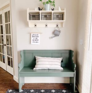
Do you like an eclectic look in your home? Especially if you have creamy walls, adding an accent with a bold piece of furniture in your bedroom or the foyer is definitely a must! For interior design styles like Cottagecore and Bohemian – this palette is definitely something to have an eye on!
Vintage Vogue Dining Room
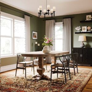
You can definitely paint all the walls of your dining room in BM Vintage Vogue – especially if there’s ample incoming natural light. Add some fresh foliage, white curtains, and a wooden dining table with a black sideboard to achieve the best results.
BM Vintage Vogue Bedroom
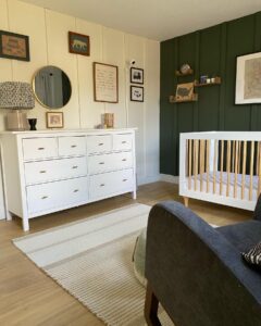
Whether it’s your bedroom or the kids’ nursery, BM Vintage Vogue can make a great statement on the accent wall. You must pair this color with warm white colors on the surrounding walls and ceiling! Moreover, add statements of satin brass for a luxe appeal!
Benjamin Moore Vintage Vogue Equivalent Colors
Comparing colors is always helpful since you get the idea of the true undertones of a paint color. After all, that’s how we know how a paint color is lighter/darker or warmer/cooler than the others!
Here, some closely similar paint colors are Benjamin Moore Backwoods, Sherwin Williams Rosemary, Sherwin Williams Pewter Green, and Benjamin Moore Dark Olive.
Let’s see how they differ!
Benjamin Moore Vintage Vogue vs Benjamin Moore Backwoods
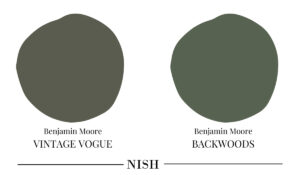
Benjamin Moore Backwoods is definitely slightly lighter than BM Vintage Vogue with an LRV of 12.68! If you observe closely, BM Backwoods can appear slightly chromatic with less gray in it and a bit more saturation than the former color.
Benjamin Moore Vintage Vogue vs Sherwin Williams Rosemary
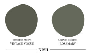
Sherwin Williams Rosemary is slightly lighter than BM Vintage Vogue with an LRV of 14. SW Rosemary is a popular green-gray paint color which is slightly warmer and more gray. Definitely a dark sage green color with a slightly more organic and earthy touch to it!
Benjamin Moore Vintage Vogue vs Sherwin Williams Pewter Green
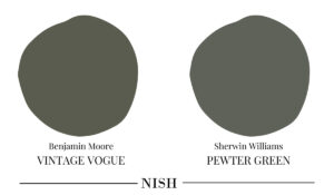
Sherwin Williams Pewter Green is a dark and bold green-gray paint color with more gray and less warmth. With an LRV of 12, this color is just slightly lighter than BM Vintage Vogue! Secondly, in my books, SW Pewter Green falls slightly on the cooler side of the scale!
Benjamin Moore Vintage Vogue vs Benjamin Moore Dark Olive
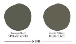
Benjamin Moore Dark Olive is a darker sage green paint color with an LRV of 13.52 – hence, slightly lighter than BM Vintage Vogue. When observed closely, this color is definitely warmer with a more earthy and organic look to it! Moreover, this color definitely has a touch of brown as well!
Benjamin Moore Vintage Vogue Takeaway
Is Benjamin Moore Vintage Vogue one of your favorite dark sage green paint colors? Well, are you excited to incorporate this color into your home? It’s definitely one of the best dark green-gray colors to have in your home on the accent wainscotting, built-in shelves, and kitchen cabinets. So, without any delay, paint that fresh coat of this versatile green-gray color and let your home feel moody and bold again!