
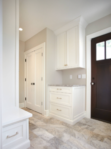
This article is dedicated to choosing the best paint colors for a west-facing room. I have personally handpicked the 10 Best Sherwin Williams paint color ideas for a west-facing room. In general, choosing a paint color for west-facing rooms is not as easy as it sounds. These rooms are comparatively cool and grey in the morning hours, meanwhile, once Noon hits – you can expect a nice and warm, golden light hitting the walls.
Just opposing the east-facing rooms, these west-facing rooms get direct and harsh exposure to the sun. I have heard my E-Design clients complaining about how specific rooms of their homes are so considerably hot in the evening and that is because late afternoon/evening light is lower and tends to directly enter your spaces and make them warmer. So, how do we deal with choosing paints in such situations?
Things to Keep in Mind When Choosing the Best Paint Colors for West Facing Rooms
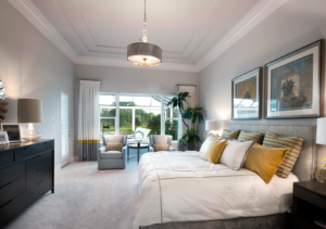
Firstly, What is the Function of Your West-Facing Room? What do you generally plan to do there? Is it a solarium? Or is it your master bedroom? How much time of the day do you intend to spend there? If you plan to spend most of the time in the morning until the afternoon, you could opt for hues that are warmer, so the cool morning light doesn’t give chilly vibes to your space.
On the other hand, if you plan to use this space during the afternoon and later when your space gets blessed with gleaming, bright golden light – I would recommend cooler-hued paint colors for these west-facing rooms.
But Nishtha, what if I use this room all day long?
Well, in that case – prioritize! Prioritize your color choices and the space you prefer to spend most of the time. Or else, prefer the
Artificial Lighting…
Install warm white or yellow lighting as your morning light since it’s cool and gray. So, I would highly recommend choosing a paint color that is neither too warm nor too cool – to assure the balance in your room throughout the day! However, don’t choose colors that are too-beige or yellow because you wouldn’t want to deal with such an energetic and overwhelming atmosphere.
West-Facing Light and Paint Colors
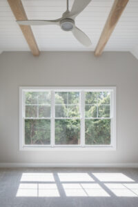
West-facing light is definitely quite tricky! In the early morning hours, you must expect the room to be slightly grayed out and shaded. Yes, at this time, the west-facing room can feel quite cool and crisp. Secondly, in the afternoon, you must expect the room to be filled with natural light (but not warmth or sun rays). Later in the afternoon and early evening hours, the warm yellow/golden/red sun rays tend to pour into the west-facing room which can be quite bright and glowy. West-facing light also has the potential to wash off the undertones!
Confusing much? Well, have a look at these lighting conditions for a west-facing room and what paint colors would work the best!
Condition 1 – Using a West-Facing Room in the Morning Hours
If you intend to use a west-facing room majorly in the morning, try choosing warm whites, warm greens, khaki, and blue paint colors with a green undertone. Try to avoid whites with a yellow or red undertone anyway! Also, choose paint colors that have more ‘chroma’ than gray since that will help balance off the undertones. Pick one of these color suggestions from the north-facing rooms and you’re good to go.
Condition 2 – Using a West-Facing Room in the Afternoon Hours
If you’re looking to use a west-facing room in the afternoon hours, expect the paint color to feel slightly shaded. There’s ample natural light and little warmth entering! So, choose cooler hues such as blue, green, and violets or even cool white or gray paint colors. Well, cool colors can help balance off the incoming warmth in the west-facing room. Meanwhile, choose colors that have considerable ‘gray’ in them!
Condition 3 – Using a West-Facing Room in the Evening Hours
This is definitely the warmest time of the day! Choose cooler-toned paint colors with considerable depth and LRV. You can even choose neutral colors (neither cool nor warm) and experiment with some bolder colors as an accent to go.
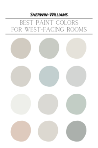
Here, I have enlisted 10 examples of west-facing paint colors from Sherwin Williams for you to take inspiration from!
10 Best Sherwin Williams Paint Colors for West-Facing Rooms
-
Sherwin Williams Agreeable Gray
Sherwin Williams Agreeable Gray is one of the best paint colors for a west-facing room. Neither too warm, nor too cool – this best-selling paint color by Sherwin Williams will definitely work well in a south-facing room, all day long. Expect this greige paint color to feel slightly muted in the early morning hours (not cool or icy). And as the sun sets, it feels cozy and glowy without getting overly warm!
With an LRV of 60, SW Agreeable Gray will also hold itself pretty well without washing off the undertones. This color is ideal for a ‘whole house color scheme’ for transitional and traditional homes.
Check out my FULL Paint Color Review Here – Sherwin Williams Agreeable Gray!
-
Sherwin Williams Silver Strand
Sherwin Williams Silver Strand is a gray neutral paint color with a touch of blue and green undertones. This color is definitely more subtle and muted as compared to SW Sea Salt or SW Rainwashed with more ‘gray’ than chroma. Especially if you intend to use the west-facing room in the afternoons – SW Silver Strand will come off quite a pretty green-blue paint color.
The LRV of Silver Strand is 59 with a medium-toned depth to it! Yes, it may look quite gray in the morning hours but can hold itself well in the shaded afternoons and well-lit evenings.
-
Sherwin Williams Origami White
Are you looking to have your west-facing room painted in a white paint color? Well, try Sherwin Williams Origami White for sure. This is an off-white paint color with the slightest touch of the ‘cool’ undertones and yet not too icy or crisp. With a wink of violet – the incoming warmth will counteract and create a balanced appeal.
Sherwin Williams Origami White has an LRV of 76 – hence, definitely crisp and fresh! In the morning hours, expect the color to appear muted with a refreshing look. In the warm afternoon and evening hours, this color will balance with the incoming warmth without looking yellow or overly warm.
-
Sherwin Williams Crushed Ice
Sherwin Williams Crushed Ice is a cool gray paint color with the slightest touch of stone undertones to prevent it from looking too icy or frosty. It can easily balance off with the incoming warm light and appear as a true neutral paint color. So, if you’re particularly fond of the gray paint colors in a west-facing room – this must definitely be on your list.
Although, it may look shaded in the morning and afternoon hours! Well, in that case, try warm artificial lighting and bulbs in the room. With an LRV of 66, this off-white with gray undertones can slightly look heavy so always remember to use it in a brightly-lit west-facing room.
-
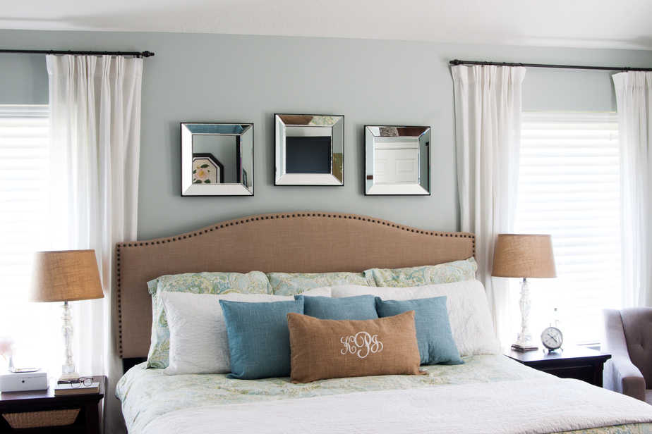
Sherwin Williams Tradewind
Sherwin Williams Tradewind is a light and airy, soft blue-gray paint color with just the slightest touch of green undertones. This breezy blue color makes a beautiful appeal in the west-facing rooms while avoiding the space from appearing overly warm. Well, even in the early mornings, this blue-gray color doesn’t come off very cold.
With an LRV of 61, this blue-gray paint color falls on the lighter end of the scale. So, in a well-lit west-facing room, this color will make a calm and coastal appeal, all day long! Yes, it’s not an icy or chilly blue paint color. The ‘green’ undertone is what softens the color up!
-
Sherwin Williams Reflection
Sherwin Williams Reflection is a cool-toned, icy blue paint color with considerable gray undertones. Especially if you intend to use the west-facing room during the afternoon hours – this paint color can truly do wonders. In the morning hours, you can expect this Sherwin Williams blue-gray color to showcase a tinge of icy blue or gray.
It has an LRV of 66 – hence, it must only be used in a well-lit west-facing room with a considerable square footage. You can even play with warm artificial lighting to add a touch of coziness and comfort. Avoid this paint color if you already reside in a northern colder region!
-
Sherwin Williams Extra White
A true bright, clean, and crisp white paint color – Sherwin Williams Extra White is all you need to soften and calm down your west-facing rooms. This bright white paint color can also be used to brighten up the west-facing rooms with little incoming natural light. Yes, with an LRV of 86 – this bright and clean white paint color is all you need to add a crisp feel.
Even with the little incoming natural light – this color in the west-facing room can be one of the best decisions you’ll ever make! Although, expect this bright white to showcase the slightest touch of a blue undertone in the early morning hours.
Check out my FULL Paint Color Review Here – Sherwin Williams Extra White!
-
Sherwin Williams First Star
Sherwin Williams First Star is an off-white paint color with a crisp gray undertone. So, if you’re looking to add a calming and crisp feel to the west-facing room – this color should definitely be on the top of your list. It may come off quite soft and not too stark in the afternoon and evening hours.
Meanwhile, in the morning, expect this color to add a refreshing and crisp statement to the room. With an LRV of 69, this color has considerable depth and wouldn’t look washed out!
-
Sherwin Williams Rainwashed
Sherwin Williams Rainwashed is a blue, green, and gray blend paint color that will work phenomenally in the west-facing room. In the morning hours, this color will hold itself pretty well with a dominant ‘green’ undertone. Yes! With the shaded look, this color will equally create a refreshing and rejuvenated appeal.
SW Rainwashed has an LRV of 59 – hence, not too light and not too dark. Even in medium to smaller-sized, west-facing rooms, this color will exhibit a beachy and coastal vibe.
Check out my FULL Paint Color Review Here – Sherwin Williams Rainwashed!
-
Sherwin Williams Malted Milk
Sherwin Williams Malted Milk is another pretty blush-peach neutral paint color for a touch of femininity and warmth. This color wouldn’t feel overly warm or cool in the west-facing room depending on the lighting conditions or square footage as well. It pairs beautifully with a fresh white paint color like SW Pure White on the trims, ceiling, and moldings.
With an LRV of 62 – this reddish neutral can hold itself pretty well with the excessive incoming golden-yellow light or grayed-out atmosphere in the morning. Hence, quite ideal for the kids’ bedrooms and play areas!
Let me know your experiences in the comments below or have a look at my interior decoration and color consulting packages so we can get one-on-one and choose the best paint for your west-facing room!


Love the Navajo white open area floor plan faces west lots of windows just don’t any a lot of yellow.
Hey Micki!
Yes! BM Navajo White is very beautiful – but it tends to showcase a prominent yellow – especially in the west-facing rooms.
Dear Nish,
I am re-modelling my kitchen and have a small dilemma… I have an 8 foot EAST facing (sink) window and on the opposite side of the kitchen an 8 foot WEST facing window … is there a colour paint that you would suggest for my kitchen cabinets? I love light neutral tones but if you suggest something darker would be more appropriate I would go with that
Thankyou so much
Suni 😊
Hi Suni, thank you for reaching out 🙂
I would love to know your design style as well as the size of the kitchen?
Thank you,
Nish
I love the Latte and Harbor Haze ones! I would love them in our living room + dining room area (as we live in a condo) that opens up to the west side balcony. But my partner is not a fan of very neutral colors and prefers more colors 🙁 Hahah! Any ideas for a more “alive” wall paint colors?
Hi Kristine, that’s good to connect 🙂 If you’re looking for paint colors that have more “color” to them – Sherwin Williams Hazel/Rain/Quietude is something to have an eye on! Even Now here’s something I’d like to ask – are you looking to paint all the walls or simply choose a color palette with an accent color and neutrals to go? Let me know at nish@nishthasadana.com 🙂