Sherwin Williams has announced the Color of the Year 2023 and it’s charming, bold, romantic, and perfectly warm and cozy – yes, Sherwin Williams Redend Point. This sweet, poised, welcoming, and EARTHY paint color is already set to revive homes with the utmost timeless and versatile appeal. Bringing a sense of calm and comfort, Sherwin Williams Redend Point is a medium-toned blush, clay, rosy brown, beige, and terracotta paint color that can absolutely soothe spaces and invite harmony.
This Color of the Year 2023 Sherwin Williams’ paint color takes inspiration from the sands of the desert and hues of nature to provide a tranquilizing experience. It’s neither a true pink/beige color nor blush or sand – rather, a perfect amalgamation of all the above-mentioned warm hues. And that’s what makes this color utterly beautiful, relatable, and imperfectly perfect.
Here’s a quick Sherwin Williams Redend Point color review to know exactly the background information on the paint color along with some dos and don’ts. I have also briefed on how, where, and when to use this Sherwin Williams Color of the Year 2023 in your homes with inspirational images to take inspiration from. So, let’s get started!
What Color is Sherwin Williams Redend Point?

Some say that Redend Point color is pink and beige whereas some call it mauve and blush – but what is it in reality? Well, to make it easier, this is a red paint color that’s neutral due to the underlying gray, blush pink, and beige undertones. And that’s the reason why SW Redend Point feels so desert-sandy and clay-like. It’s not a terracotta color due to the minimal orange undertone and not even mauve. When you compare this color with SW Cavern Clay – you’re quite likely to observe the neutral, muted, and subdued characteristics of this paint color. Yes, quite confusing, right?
Here’s a well-curated pre-made color palette that I have created for SW REDEND POINT on Etsy! It enlists all the exact colors that pair with Redend Point including how and where to use them in your whole house color palette. I have included 5 color palettes (with Redend Point and complementary hues) along with how to use each of those paint colors in various areas of your home. You’ll also get the detailed MATERIAL and FABRIC palette with each of SW Redend Point color palettes!
Here’s also where you can find the PREPACKAGED Color Palette – Sherwin Williams REDEND POINT
Sherwin Williams Redend Point LRV
Sherwin Williams Redend Point has an LRV of 30, which means it falls on the medium to the medium darker end of the scale. LRV stands for Light Reflectance Value which determines how light or dark the paint color is. Well, on a scale of 0-100, 0 being the darkest!
So, considering the LRV of Redend Point by Sherwin Williams, here are a few do’s and don’ts to have an eye on!
- In rooms with little natural lighting, this color could appear quite dark and flat! Hence, remember to allow adequate lighting to enter the space to feel the true beauty of the color.
- Due to the presence of color in this particular paint color (minimal gray), it tends to not fade away the undertones – which makes a wonderful option in a room of any number of sizes or corners.
- In larger rooms, this color looks phenomenal when painted on all the walls. In smaller rooms, try the concept of accent walls, maybe?
Sherwin Williams Redend Point Undertones
Sherwin Williams Color of the Year 2023, Redend Point, definitely has a blend of gray, beige, and pink undertones. This is truly a red color but with subtle hints of brown, pink, and gray. Under certain lighting conditions, you can readily expect a clay-like tone whereas in some, a deep brown/pink/blush appearance. Nowhere will this color appear gray since it’s far away from a neutral tone.
However, the undertones are highly subjected to the compass directions of a room, the size of the space, and the existing architectural elements. Let’s see how the Redend Point paint works for different compass directions in your home.
- In the north-facing rooms, SW Redend Point will neutralize with the incoming cool light to retain the original hue. Hence, I recommend this paint color for west-facing and east-facing rooms as well where the light is either dull during early morning or late evening. Sherwin Williams Redend Point has ample color or undertones to itself, which will not fade away in rooms with dull light as well!
- On the other hand, in the south-facing rooms, this color will warmly welcome the incoming sunshine and make the space appear too WARM and hot! Be careful with this paint color in the southern warmer states or regions with immense humidity all year long.
Is Redend Point Warm or Cool?
Sherwin Williams Redend Point is definitely a WARM-toned paint color. The obvious undertones of pink, beige, and gray in the red prove how creamy, calm, comfortable, and warm the paint color is. It’s nowhere closer to cool! However, that doesn’t mean that this color can’t be used in a cool-toned color palette. (You’ll have to wait for a bit because I have disclosed the palettes later in the color review)
Does Redend Point Look Terracotta?
Redend Point by Sherwin Williams has a tinge of terracotta but definitely not one! If you compare it with SW Cavern Clay, you’re quite likely to observe a difference. Moreover, Redend Point lacks the dominant burnt orange undertone that might make it feel closer to a shade of terracotta.
Does Redend Point Look Pink or Blush?
Don’t be surprised if you do! Yes, Redend Point appears pink or peige (pink + beige) under certain lighting conditions. So, if you like beige with pink undertones – you’re definitely going to love SW Redend Point.
Can I Use Redend Point In the Whole House?
Definitely NO! Redend Point must not be used everywhere. And with that, I meant the common walls and other hallway walls of your home. This color is way TOO dark to be used everywhere and can undeniably make the home feel dull, dark, flat, and dingy! If you’re fond of pink-beiges on the common walls, you might like SW Modest White. A little darker option would be SW Malted Milk which holds immense color and undertones in it.
What is a Shade Lighter of Redend Point?
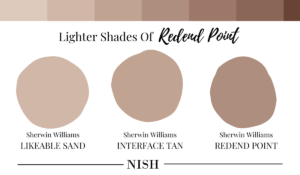
Wondering how dark SW Redend Point walls look but love the whole idea of a blend of pink, beige, gray, and red? Well, in such a case, you have the opportunity to choose from the lighter shades of Redend Point. Sherwin Williams Interface Tan is a shade lighter of Redend Point! It looks phenomenal on the focal cabinets, furniture frames, and entryway doors. Further lighter tones are Sherwin Williams Likeable Sand and Sherwin Williams Malted Milk.
I personally also love the feel of Sherwin Williams Sandbank which has a slightly rosy touch with an LRV of 40.
What is a Shade Darker of Redend Point?
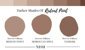
Here are the two paint colors that are slightly darker than Sherwin Williams Redend Point –
- Sherwin Williams Moroccan Brown with an LRV of 22
- Sherwin Williams Tanbark with an LRV of 15
How To Use SW Redend Point?
This was one of the most frequently asked questions at the announcement of the Sherwin Williams Color of the Year 2023. Especially with such a controversial color, there are further related doubts and queries. So, how to use SW Redend Point in homes and how can homeowners make a statement using this paint color?
Well, now that we know, Sherwin Williams Redend Point paint is bold, full of color, and dramatic. Using this color on all the walls in a smaller room with little incoming light wouldn’t be ideal. It will further make the space appear dark and unromantic! On the other hand, you can consider applying this paint on all the walls of your room only if it’s large and spacious. Lighting could be simply sufficient or adequate! Even with ample light, don’t worry about the paint color getting washed away!
Where To Use SW Redend Point?
Sherwin Williams Redend Point works the best as an ACCENT! Here’s a list of ways to creatively use SW Redend Point in your home!
- Laundry Cabinets
- Mudroom Cabinets
- Bathroom Walls
- Bedroom Accent Walls
- Focal Furniture
- Ceiling
- Trims, Door, and Window Moldings
- Entryway Door
- Wainscotting
- Wall Paneling
- Kids’ Rooms
What Colors Go With Redend Point?
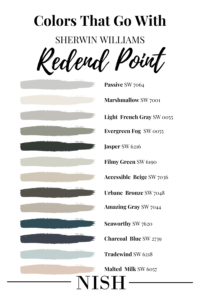
Sherwin Williams Redend Point works beautifully in warm as well as cool-toned color palettes. In the warmer palettes, this Color of the Year 2023 can exhibit a warm, welcoming, and subtle experience. It makes your home feel more inviting and welcoming with a creamy and soothing touch. Whereas in the cool-toned palettes, it can juxtapose and create a striking visual contrast. So, in my books, you can truly create either – depending upon the interior design style and color scheme of your home.
Generally, SW Redend Point will best complement creamy whites (with a touch of pink, neutral whites, lighter dusty pink/rose, darker greens, beiges and browns, darker midnight blues, lighter to medium-toned muddy grays, black, and sage greens. Looking for the exact paint color names?
Well, here’s a list of Sherwin Williams Whites and Off-Whites that go with Sherwin Williams Redend Point –
- SW 7005 Pure White (for trims and ceiling)
- SW 7757 High Reflective White (for trims and ceiling)
- SW 7004 Snowbound (for trims and ceiling)
- SW 7008 Alabaster (for adjacent walls)
- SW 6084 Modest White (for adjacent walls)
Here’s a list of Sherwin Williams Grays that go with Sherwin Williams Redend Point –
- SW 7064 Passive
- SW 7666 Fleur de Sel
- SW 0055 Light French Gray
Moving on, here’s a list of Sherwin Williams Greens that go with Sherwin Williams Redend Point –
- SW 9130 Evergreen Fog
- SW 6216 Jasper
- SW 6190 Filmy Green
Beige and browns play phenomenal! Here’s a list of Sherwin Williams Browns and Beiges that go with Sherwin Williams Redend Point –
Here’s a list of Sherwin Williams Blues that go with Sherwin Williams Redend Point –
- SW 7620 Seaworthy
- SW 2739 Charcoal Blue
- SW 6218 Tradewind
Do check out this list of Sherwin Williams Pinks/Blush/Dusty Rose that go with Sherwin Williams Redend Point –
- SW 6057 Malted Milk
- SW 6056 Polite White
- SW 7001 Marshmallow
What Trim Colors Go With Redend Point?
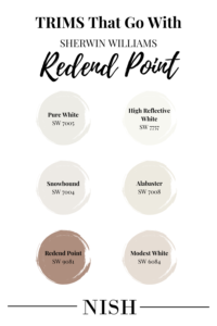
When choosing the perfect trim paint colors for Redend Point, you must be very careful. White paint colors tend to have yellow, pink, taupe, blue, or green undertones – which therefore can contradict with SW Redend Point. Hence, to avoid confusion, here is a list of trim paint colors for Sherwin Williams Redend Point that will never disappoint you!
This is a classic neutral white paint color on the creamy end of the scale. It has a balance of yellow and gray just to perfectly complement Redend Point without overpowering it. Whenever in doubt, choose SW Pure White!
This is a cleaner and whiter version of SW Pure White that feels quite neutral. Due to the lack of undertones, this color will always make the Redend Point walls protrude. Hence, a versatile and classic choice for trims, ceiling, and moldings.
Sherwin Williams Snowbound has cool pink/gray undertones that will perfectly complement the Redend Point walls. If you want to subtle down the undertones of SW Redend Point, choose SW Snowbound as it will play a timeless role.
Sherwin Williams Alabaster is a creamy off-white that will beautifully work with SW Redend Point. It will calm the undertones of the paint color and make it appear more neutral!
Wondering why I’d recommend Sherwin Williams Redend Point on the ceiling? Well, if you’re looking for a sleek, modern, and minimalist look in your room – I recommend that you pick SW Redend Point for the walls, trims, and ceiling.
Can I paint the walls, ceiling, and trims in SW Redend Point? Well, Yes!
Where to Use SW Redend Point In Homes?
The wait is over! As discussed earlier, Sherwin Williams Redend Point can be used in various spaces and areas of your home. From wall paneling to vanity, built-in shelves to entryway doors – the list is truly endless. Let’s take a sneak peek into the inspirations!
Sherwin Williams Redend Point Walls
You can paint all the walls, ceiling, and trims in SW Redend Point! If you’re looking for a traditional look – consider this paint only on the walls and pair it with creamy or true white on the ceiling and trims. For this palette, you must allow adequate natural light to enter the space.
Sherwin Williams Redend Point Front Door
Let the entryway door of your home grab the attention of all the neighbors walking by! You can absolutely pair SW Redend Point front door with creamy white exterior walls for the best results.
Sherwin Williams Redend Point Kitchen Cabinets
SW Redend Point could be a very specific color for the kitchen cabinets. Even though it looks beautiful, calm, and soothing – it may not be very versatile, in general. This color is quite difficult to pair with marble countertops and backsplash tiles. Hence, something I wouldn’t recommend! However, this color might play a great role for the cabinets in your laundry room, foyer, and mudroom.
Sherwin Williams Redend Point in Furniture
Ever thought of painting that piece of focal console table in a specific color? Well, SW Redend Point has the potential to spark a sense of contrast and pop a hue on that piece of focal furniture.
SW Redend Point Equivalent Colors
SW Redend Point shares a couple of other similar color alternatives. Some might have a dominant blush undertone and some terracotta.
Two closely similar paint colors are Sherwin Williams Hushed Auburn and Sherwin Williams Velvety Chestnut.
Let’s see how they differ!
Redend Point Vs Hushed Auburn
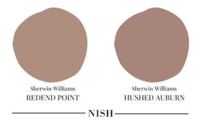
Sherwin Williams Hushed Auburn is a rosier version of SW Redend Point. It has a dominant brown and pink undertone!
With an LRV of 26, this color is slightly darker than the former.
Note that this color feels less neutral and has more color to it.
Redend Point Vs Velvety Chestnut

Sherwin Williams Velvety Chestnut has a slightly deeper touch of mauve and pink to the reddish-brown base.
This paint color also has an LRV of 27 – thus, equally dark, bold, and deep! However, nowhere close to a neutral!
Redend Point Takeaway
Unlike the previous SW Colors of the Year, this year’s paint is not very versatile and may not be liked by every homeowner. However, it’s important that you have an eye for this color – to truly love it! So, are you looking to incorporate Redend Point into your home? Well, do let me know in the comments below!


