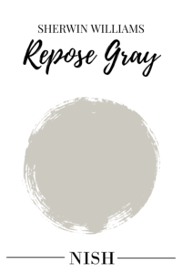
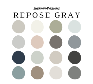
Sherwin Williams Repose Gray is a popular warm gray paint color that can make an ideal choice for any corner of your home. This gray paint color can make any space feel just so elegant, neutral, and sophisticated with a wink of warmth to prevent it from looking cold or icy gray. With the slightest hint of taupe and green undertones, SW Repose Gray is all set to fall under the ‘greige’ end of the scale. Well, Sherwin Williams Repose Gray is one of my favorite neutral paint colors that will never make your space feel old or monotonous. Many homeowners and designers have absolutely loved this paint color in their homes and you’re bound to find endless design inspirations online! After all, it’s also one of the best-selling neutral paint colors by Sherwin Williams.
So, what is all the fuss about? And why does Repose Gray by Sherwin Williams have all the eyes? Well, in this color review, I am going to disclose EVERYTHING you need to know about Sherwin Williams Repose Gray. We’re going to discuss the undertones, Light Reflectance Values (LRVs), where and how to use the color in your home, color comparisons, FAQs, and much more! Excited much? Let’s get started!
What Color is Sherwin Williams Repose Gray?
Sherwin Williams Repose Gray is a classic and timeless greige paint color (warm gray) that slightly inclines on the cooler end of the scale. With a blend of ‘beige’ and ‘gray’, this Sherwin Williams popular paint color can effortlessly work for a variety of design styles without looking outdated in the coming years. Yes, it definitely has more ‘gray’ than ‘beige’ to it! And since this paint color isn’t too light or dark – it can make a perfect ‘whole house color scheme’. Especially if you have a larger-sized home with ample incoming natural light – this color may be the best option for your home.
As opposed to some other popular greige paint colors by Sherwin Williams, Repose Gray stands at the cooler end of the scale. However, it can be used for both warm as well as cool-toned color palettes of your home. Especially for interior design styles like Modern Farmhouse, transitional, traditional, modern, contemporary, and Modern Classic – this paint color will work beautifully. I’d recommend that you try this ready-to-order swatch in different rooms with different lighting conditions to determine how SW Repose Gray will truly feel in your home.
Click here to get a peel & stick sample of Sherwin Williams Repose Gray
Is Sherwin Williams Repose Gray Warm or Cool?
Repose Gray by Sherwin Williams is definitely a cooler-toned greige paint color with the slightest hint of warmth. And trust me, it all depends on how you perceive a paint color! It may look warm under certain lighting conditions and also read ‘cool’ at other times of the day. Greige paint colors are a blend of ‘gray’ and ‘beige’ – and with SW Repose Gray, you can expect more gray than beige! Yes, it is way cooler than most of the other popular greige paint colors.
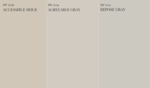
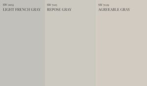
For instance, if you place a swatch of SW Agreeable Gray, SW Repose Gray, and SW Accessible Beige – you’ll find Repose Gray to be the ‘grayest’ of all! Meanwhile, if you place a swatch of SW Repose Gray, SW Light French Gray, and SW Repose Gray – you’ll observe the slightest hint of warmth in this color. You see, this color isn’t very easy to deal with!
What Is Sherwin Williams Most Popular Gray?
Repose Gray is definitely one of the most popular gray paint colors by Sherwin Williams. It isn’t too dark or too light and neither is an icy or cold gray to make a space feel cool and crisp. With the perfect touch of warmth, this timeless and versatile paint color can work effortlessly in most interior design styles and color palettes. Yes, this is also what makes it one of the best-selling paint colors.
Is Repose Gray Too Dark?
SW Repose Gray has the potential to appear slightly dark in smaller spaces or rooms that receive low natural light. Well, yes! This color has some depth to it and is ideal for medium or larger homes that are either south or west-facing and receive ample incoming natural light. This way, you can feel the true beauty of this color!
Which is Better, Agreeable Gray or Repose Gray?
In my books, I’d prefer Agreeable Gray more than Repose Gray since it’s slightly more neutral with the perfect blend of ‘beige’ and ‘gray’ undertones. It’s neither too warm nor too cool and is definitely way more versatile and flexible to pair with! However, if you have a cooler-toned palette, SW Repose Gray may work better.
What are the Undertones of Sherwin Williams Repose Gray?
Sherwin Williams Repose Gray has a wink of violet and green undertone – but not very dominant though. In general, Repose Gray walls are slightly on the cooler end of the scale with a touch of warmth! Only with picky or ‘weird’ architectural elements around, this color can tend to showcase a hint of green or violet. But remember, with lots and lots of natural light, this greige color will always feel balanced, neutral, and true to its nature.
Repose Gray tends to appear slightly different under different lighting conditions. In general, you can use this color in any compass direction but you must know how it will end up looking. In a room with little natural light, make use of artificial lights to help this color feel sleek and cozy. On the other hand, this color is bound to look flawless even in a room filled with ample natural light. Let’s discuss how this color behaves in different lighting conditions –
- In the north-facing rooms, SW Repose Gray can certainly come off cool and cold with the incoming natural light. You may also find colder corners with some shadows!
- In the south-facing rooms, Repose Gray paint color can look potentially warm, soothing, glowing, and comforting cozy. South-facing is where the Repose gray walls live the best!
- In the east-facing rooms, Sherwin Williams Repose Gray is bound to showcase a wink of warmth in the morning but as the sun sets – expect the color to slightly cool down.
- In the west-facing rooms, Repose Gray paint color can play the opposite of the east-facing rooms. Yes, slightly cooler in the mornings with a touch of warmth, as the sun sets!
SW Repose Gray LRV
Light Reflectance Value or LRV is an important aspect to consider when choosing the best neutral paint color for your home. This value determines how light or dark the paint color is – on a scale of 0-100. Hence, the darker the paint color, the lower the LRV is!
The Light Reflectance Value (LRV) of Repose Gray is 58. Hence, neither too light nor too dark! This color will always play versatile in a medium or larger-sized square footage and a room that receives considerable incoming light. Well, SW Repose Gray has the tendency to weigh down a space and add more depth than usual!
Can I Use Sherwin Williams Repose Gray For The WHOLE HOUSE?
Definitely, yes! Rather, this is one of my top picks for a WHOLE HOUSE Color Scheme. You can use Repose Gray paint Sherwin Williams for all the common walls of your home, open-concept living and dining, exteriors, and other bedrooms as well. However, with this greige paint color, you must allow considerable natural light to enter the home at all times. Another consideration is the square footage of your home! With medium or larger-sized homes, SW Repose Gray can play a beautiful role as a whole house color. Avoid this color as a whole house color in smaller homes or homes that receive less incoming natural light.
How To Use SW Repose Gray Paint?
SW Repose Gray can be used as a perfect base or neutral in your home. You can choose to use this Sherwin Williams greige color for all the common walls of your home, all neutral bedroom walls, kitchen cabinets, and exteriors, and as a base on all the walls of your open-concept living and dining. And since this color has a balanced and neutral base – you can choose this repose gray color for all the warm as well as cool-toned color palettes. Especially for interior design styles like modern, contemporary, transitional, traditional, modern Farmhouse, French Country, and Mid-Century Modern – this cool-toned warm gray color will work phenomenally.
Here’s a well-curated pre-made color palette that I have created for SW Repose Gray on Etsy! It enlists all the exact colors that pair with Repose Gray color including how and where to use them in your whole house color palette. I have included 5 color palettes (with Sherwin Williams Repose Gray and complementary hues) along with how to use each of those paint colors in various areas of your home. You’ll also get the detailed MATERIAL and FABRIC palette with each of SW Repose Gray color palettes! Another bonus is PAINT PLANNER and a detailed guide on paint sheens for various areas of your home.
Here’s where you can download the palette – Sherwin Williams Repose Gray
Where To Use SW Repose Gray Paint in Your Home?
Repose Gray Sherwin Williams can be used in various areas of your home. As a base and neutral, this color can be used as a contrast with accent walls, cabinets, vanity, wainscotting, or shutters. Here’s where you can use this SW Repose Gray paint color –
- Bedroom Walls
- Exterior Walls
- Ceilings and Trims
- Exterior Shutters and Trims
- Open Concept Living & Dining
- Hallways
- Kitchen Cabinets
- Bathroom Walls
- Bathroom Vanity
- Laundry Room Cabinets
- Home Office Walls
- Interior Doors
- Exterior Doors
- Moldings
- Kids’ Rooms
- Family Rooms
What Colors Go With Repose Gray?
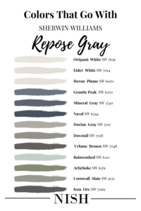
Paint colors that go with SW Repose Gray are neutral or crisp whites, clean whites with no yellow undertones, navy or stormy blue, blue-gray, green-gray, olive green, rust, shades of plum, violet, blue-green, and blush. Yes, you name the color category and it can work seamlessly with this paint color.
Here’s a list of Sherwin Williams white paint colors that go with Sherwin Williams Repose Gray –
Now, here’s a list of Sherwin Williams blue colors that go with Sherwin Williams Repose Gray –
- Sherwin Williams Naval
- Sherwin Williams Granite Peak
- Sherwin Williams Mineral Gray
- Sherwin Williams Cyberspace
Check out this list of Sherwin Williams greige colors that go with Sherwin Williams Repose Gray –
Here’s a list of Sherwin Williams green-gray colors that go with Sherwin Williams Agreeable Gray –
- Sherwin Williams Rainwashed
- Sherwin Williams Artichoke
- Sherwin Williams Cornwall Slate
What Trim Colors Go With SW Repose Gray?
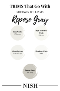
Generally, Repose Gray works beautifully with clean or neutral white paint colors on the ceiling, trims, and moldings such as SW Pure White or SW High Reflectance White. It definitely creates a beautiful contrast against the cool-inclined greige walls with SW Repose Gray. I would also choose SW Repose Gray for trims, moldings, and ceiling as well for a seamless look. Here’s a list of Sherwin Williams, Benjamin Moore, and Behr white colors to pair as a trim with SW Repose Gray.
Sherwin Williams Pure White is a soft and neutral white trim paint color that absolutely blends with SW Repose Gray. Whether warm or cool-toned palettes, this trim paint color should definitely be on the top of the list.
Sherwin Williams High Reflective White is a cleaner and crisper approach to SW Repose Gray walls. So, if you’re looking to create a greater contrast with greige walls, SW High Reflective White is definitely something to have an eye on! It’s way lighter, clean, brighter, and crisper than SW Pure White.
BM Chantilly Lace is another clean and bright white paint that works wonderfully with Sherwin Williams Repose Gray paint color. In the case of contemporary, Scandinavian, Modern Farmhouse, and modern design styles – this trim color will never disappoint you!
Lightest and cleanest of them all, Behr Ultra Pure White is a clean and bright white paint that makes the ceilings appear higher and your dull corners brighter. A must-recommend for SW Repose Gray paint color!
I’d personally recommend SW Repose Gray trims, moldings, and ceilings to go with SW Repose Gray walls. Especially if you’re looking for a seamless approach, this trim color is definitely to go! Repose Gray ceiling and Repose Gray walls will further make your space look seamless, moody, and modern.
Where To Use Sherwin Williams Repose Gray in Your Homes?
As mentioned earlier, Repose Gray Sherwin Williams can make a sleek and modern statement in any corner of your home. Well, if you’re excited to have a look at some inspirations of how this color has been used creatively, here’s a list to follow!
Sherwin Williams Repose Gray Interior Doors
SW Repose Gray interior doors look just so modern, sleek, and timeless! So, if you’re bored of an all-white panorama in your home, you can choose to paint the interior doors in SW Repose Gray to create the slightest contrast. This warm gray paint color will definitely create a chic and sophisticated appeal in your home. Moreover, you may either choose satin brass or matte black hardware to go!
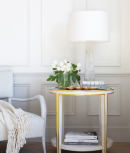
SW Repose Gray Living Room
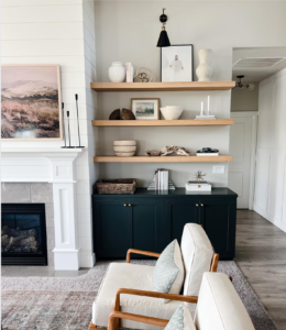
Repose Gray can make a wonderful statement in the living room for an absolute modern and timeless statement. Especially if you have higher ceilings and ample incoming natural light – this color can truly make a beautiful and calming appeal. In this image, the cabinet color is Rock Bottom by Sherwin Williams and trims and ceiling in SW Pure White.
SW Repose Gray Exteriors
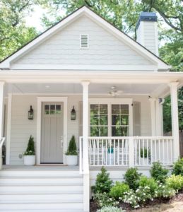
SW Repose Gray exteriors look great for Modern Farmhouse and even Craftsman style homes! Yes, this is definitely one of the best greige colors for the exteriors of a home. This color can showcase more ‘gray’ than ‘beige’ outdoors and will never make you feel bored or monotonous. In this image, the front door is painted in SW Dorian Gray and trims in SW Alabaster.
Repose Gray Kitchen Cabinets
Repose Gray kitchen cabinets are my absolute favorite! They will never make you feel bored and monotonous and can even work wonderfully in smaller spaces. Pair with SW Pure White on the ceilings and some satin brass hardware for the utmost rich and sophisticated appeal. Isn’t this kitchen setup so luxe?
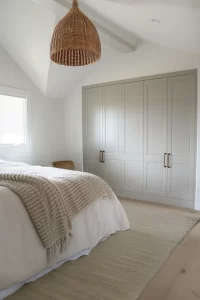
Sherwin Williams Repose Gray Bedroom
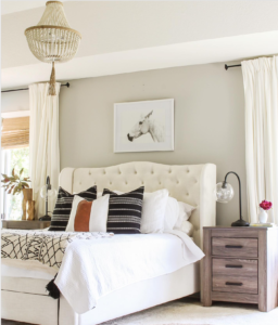
Especially if you have a master bedroom facing the south-facing direction, this color is bound to look phenomenal on all the walls. SW Repose Gray bedroom is quite soothing and versatile and can best pair with pops of hues on the accessories and furnishings. Whether coastal interior design style or Modern Farmhouse – this color will definitely work timelessly!
SW Repose Gray Wainscotting
Greige-painted wainscotting is my absolute favorite! Whether you have a wainscotting running in the dining room or powder bathroom – SW Repose Gray is bound to work effortlessly! You must either pair this warm gray color with SW Extra White or SW Pure White on the walls.
SW Repose Gray Bathroom Vanity
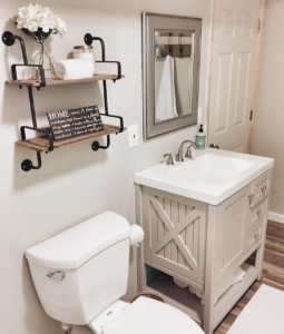
This bathroom vanity painted in SW Repose Gray is absolutely charming and versatile! Well, SW Repose Gray plays a wonderful role when painted on the vanity as well as cabinets, isn’t it? You can even choose a few shades darker such as SW Mindful Gray or SW Dorian Gray!
SW Repose Gray Whole House Scheme
Sherwin Williams Repose Gray is a great recommendation for the whole house color scheme! Especially if you have a larger-sized home with ample incoming natural light and greater ceilings – this color is bound to work effortlessly! Absolutely amazing, isn’t it?
Sherwin Williams Repose Gray Equivalent Colors
Comparing colors is always helpful since you get the idea of the true undertones of a paint color. After all, that’s how we know how a paint color is lighter/darker or warmer/cooler than the others!
Here, some closely similar paint colors are Sherwin Williams Agreeable Gray, Sherwin Williams Big Chill, Sherwin Williams Crushed Ice, and Sherwin Williams Mindful Gray.
Let’s see how they differ!
Sherwin Williams Repose Gray vs Agreeable Gray
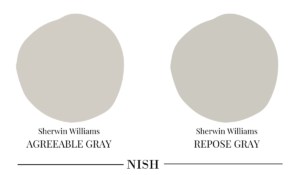
Sherwin Williams Repose Gray is a slightly cooler version of SW Agreeable Gray. So, if you’re looking for a greige paint color with a bit more ‘gray’ than ‘beige’ – SW Repose Gray it is! Moreover, Repose Gray definitely has more depth to it – with an LRV of 58 as opposed to Agreeable Gray which stands at 60.
Sherwin Williams Repose Gray vs Big Chill
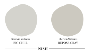
Sherwin Williams Big Chill is slightly cooler and lighter than SW Repose Gray. With an LRV of 62, this light gray paint color with just a touch of warmth can make a wonderful statement in the cool-toned color palettes. So, if you’re looking for a gray paint color that has the slightest touch of warmth – Big Chill can prove to be a better option. Repose Gray definitely has more subtle warmth!
Sherwin Williams Repose Gray vs Crushed Ice
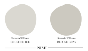
With an LRV of 66, Sherwin Williams Crushed Ice is way lighter than SW Repose Gray. This is a darker off-white gray paint color with some passive warmth to it! So, if you particularly find SW Repose Gray slightly darker with more depth – Crushed Ice can be your next best friend!
Sherwin Williams Repose Gray vs Mindful Gray
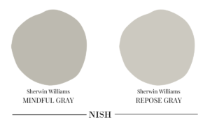
A couple of tones darker than SW Repose Gray, Mindful Gray has an LRV of 48. So, if you’re looking for a darker greige color that can make a bolder contrast and accent – SW Mindful Gray is definitely something to have an eye on! Well, this darker greige looks absolutely beautiful on the interior doors!
Sherwin Williams Repose Gray Takeaway
Is Sherwin Williams Repose Gray one of your favorite greige paint colors? Well, are you excited to incorporate this color into your home? It’s definitely one of the best balanced and neutral greige paint colors to have in your home. So, without any delay, paint that fresh coat of this greige color and let your home feel cozy and welcoming again!