Color of the Year 2024, Sherwin Williams Upward is a relaxed and laid-back blue color that closely relates to a coastal palette. This muted upward paint color feels cool, calm, and crisp with major gray undertones. However, unlike the other Sherwin Williams blue-gray paint colors – Upward can be a tricky option to choose (I am going to reveal that slightly later in the blog). So, if you’re looking to style a beach-style home or a modern coastal palette – Sherwin Williams Upward can truly make a beautiful choice.
Upward by Sherwin Williams may not be very versatile but can still make a beautiful choice in various design styles. I’d like to recommend using SW Upward for coastal and beach homes, transitional and French Farmhouse, and even Modern Farmhouse. The pale blue-gray color is gorgeous but I wonder if it’s as easy to blend as Sherwin Williams Evergreen Fog (Color of the Year 2022) and Sherwin Williams Urbane Bronze (Color of the Year 2021). Wondering what the Sherwin Williams Color of the Year 2024 has to offer? Stay tuned!
What Color is Upward by Sherwin Williams?

Sherwin Williams Upward is blue-gray paint color with a hint of periwinkle and purple undertones. This muted and subdued blue paint color by Sherwin Williams can feel quite cool, crisp, fresh, lively, and airy. However, the sneaky purple undertones can be quite difficult to work with! And that’s why I’d recommend that you choose this color as an accent or a base! (Don’t worry, I am going to reveal how to style with SW Upward slightly later in the blog)
As I mentioned, SW Upward may not be a very easy color to work with, flexible, or even versatile. Avoid using this color in a warm-toned palette and rather embrace the beauty in a cool-toned home. Beige countertops? No! Greige painted walls? No! Warm hardwood flooring? No!
I’d recommend that you try this ready-to-order swatch in different rooms with different lighting conditions to determine how Sherwin Williams Upward will truly feel in your home.
Click here to get a peel & stick sample of Sherwin Williams Upward
Is Sherwin Williams Upward Blue or Gray?
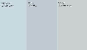
Sherwin Williams Upward is a beautiful blue-gray color with a major inclination for the “blue” chroma and lesser gray. This neutral blue-violet gray is more calming and crisp than blue-green or blue-gray. I’d also define this color as a “denim blue” color. If you compare a swatch of SW North Star, SW Upward, and SW Moonmist – you’ll observe how “violet” or “purple” SW Upward appears. Even based on the natural incoming lighting conditions and existing architectural elements, the Upward paint color can either incline towards the blue, violet, or gray undertone.
Is Sherwin Williams Upward Cool or Warm?

Generally, cool gray paint colors have either green, blue, or violet undertones. SW Upward is a cool-toned blue-gray color with dominant periwinkle or purple undertones. Unlike other cool-toned blue-gray paint colors, this Color of the Year 2024 is quite crisp and refreshing. Yes! It’s nowhere closer to being warm. If you compare a swatch of Sherwin Williams Upward, Sherwin Williams Passive, and Sherwin Williams Tradewind, you’d feel how cool, crisp, and “violet-inspired” this color appears.
What are the Undertones of Sherwin Williams Upward?
Sherwin Williams Upward undertones can be quite tricky and challenging. The hidden ‘violet’ can appear different in different lighting conditions and can be difficult to pair with warm-toned furnishings and elements. Moreover, if the other warmer or cooler tones in your home have a hidden pink, yellow, or green undertone – this blue gray color with purple undertones can totally contradict.
And due to these undertones, there’s one tricky characteristic of SW Upward that you may not want to miss. Well, SW 6239 Upward color can potentially alter its appearance as the day goes by! Long story short, expect this blue gray color to appear slightly different at different times of the day. Yes – natural light can drastically change the way a color looks. Let’s discuss how this color behaves in different lighting conditions –
- In the north-facing rooms, Sherwin Williams Upward has the potential to appear bluish-gray due to the cool incoming light.
- In the south-facing rooms, SW Upward can potentially look much lighter and brighter with the incoming warm early afternoon light. The purple undertones can slightly show up and know that this direction is one of the best for SW Upward.
- In the east-facing rooms, Upward by Sherwin Williams can appear bright and cozy in the morning and cool-toned gray and violet in the evening.
- In the west-facing rooms, SW Upward will appear fresh and airy, light blue gray all day long.
What’s the LRV of SW Upward?
Sherwin Williams Upward has an LRV of 57 – hence, neither too light nor too dark. Of course, you can use this color as a base on all the walls of a room or even as an accent on the wainscotting, furniture, ceiling, or cabinets. Light Reflectance Value or LRV is an important aspect to consider when choosing the best neutral paint color for your home. This value determines how light or dark the paint color is – on a scale of 0-100. Hence, the lighter the paint color, the higher the LRV is! I’d personally use this color in a small to medium-sized room.
What is One Shade Darker Than Upward?

Sherwin Williams Windy Blue is a shade darker than Sherwin Williams Upward. This light and breezy blue gray color has an LRV of 48 – hence, slightly darker and deeper than SW Upward.
What is One Shade Lighter Than Upward?
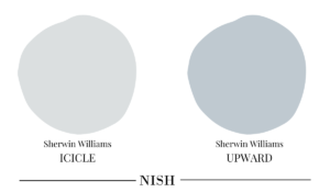
Sherwin Williams Icicle is a shade lighter than SW Upward. This cool off-white color has deep blue gray undertones to introduce a crisp and refreshing vibe indoors. Works amazingly as a pastel in cool-toned homes!
Can I Use Upward Sherwin Williams For The WHOLE HOUSE?
Absolutely NO! I wouldn’t recommend using Sherwin Williams Upward for all the common walls, hallway and foyer walls, and stairway walls of your home. Well, that would truly be TOO much! Unless you have an admiration for baby blue walls in your coastal or beach-side home, I’d recommend that you stay away. The cool and crisp look of the color can truly dominate and make your home appear cold and dreary.
This blue gray sherwin Williams color is ideal for small, medium, or even larger homes. If not on all the walls – you can consider choosing this color as an accent on the wainscotting, ceiling, cabinets, or accent furniture.
How To Use SW Upward Paint?
I’d personally like to use SW Upward as an accent or base in a home. The true beauty of this upward paint color is to use it as a base or accent in various areas of your home for a cohesive palette. For instance, you can use this color on the entryway door, a bedroom’s accent wall, a kitchen island or lower cabinets, a kids’ play area, or the accent wainscoting in a bathroom. Too much of this color can feel quite boring, crisp, and monotonous. And that’s why I’d say that you restrict the use of this color ‘everywhere’.
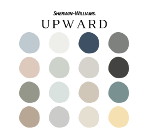
Here’s a well-curated pre-made color palette that I have created for SW Upward on Etsy! It enlists all the exact colors that pair with Upward color including how and where to use them in your whole house color palette. I have included 5 color palettes (with Sherwin Williams Upward and complementary hues) along with how to use each of those paint colors in various areas of your home. You’ll also get the detailed MATERIAL and FABRIC palette with each of SW Upward color palettes! Another bonus is PAINT PLANNER and a detailed guide on paint sheens for various areas of your home.
Here’s where you can download the palette – Sherwin Williams Upward
Where To Use SW Upward Paint in Your Home?
As mentioned, Upward from Sherwin Williams can make a beachy and calming appearance as an ACCENT or BASE in various areas of your home. You can certainly use the upward color in approximately two, three, or four spaces for a cohesive color palette. To name a few, here’s where you can use this paint color sea salt in your home –
- Bathroom Vanity
- Bathroom Wainscotting
- Entryway Door (Exteriors or Interiors)
- Exterior Shutters
- Interior Doors
- Bedroom Accent Walls
- Kitchen Cabinets
- Kids’ Rooms
- Mudroom Cabinets
- Laundry Room Cabinets
- Accent Furniture
What Color Goes Well With Sherwin Williams Upward
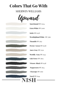
Colors that go with Sherwin Williams Upward are crisp and creamy whites, off-white with yellow undertones, navy blue, charcoal grays, purples, tan, beige, greige, and black.
Here’s a list of Sherwin Williams white colors that go with Sherwin Williams Upward –
- Sherwin Williams Icicle
- Sherwin Williams Extra White
- Sherwin Williams Snowbound
- Sherwin Williams Westhighland White
Here’s a list of Sherwin Williams gray colors that go with Sherwin Williams Upward –
- Sherwin Williams Tinsmith
- Sherwin Williams Cityscape
- Sherwin Williams Peppercorn
- Sherwin Williams Tricorn Black
Now, here’s a list of Sherwin Williams greige and beige that goes with Upward Sherwin Williams –
- Sherwin Williams Anew Gray
- Sherwin Williams Worldly Gray
- Sherwin Williams Shiitake
- Sherwin Williams Mega Greige
Now, here’s a list of Sherwin Williams navy blue colors that go with Upward Sherwin Williams –
- Sherwin Williams Naval
- Sherwin Williams Gale force
- Sherwin Williams Cyberspace
What Trim Colors Go With SW Upward?
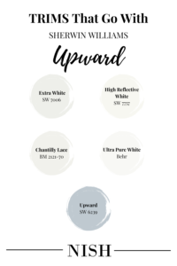
With Sherwin Williams Upward, I’d pair the cool, clean, and crisp white colors so the undertones can show up beautifully! Here are some examples to illustrate!
Sherwin Williams High Reflectance White is a clean and stark neutral white color with an LRV of 93. It’s definitely the “lightest” of the lot and can further show up the undertones of SW Upward beautifully. This clean white color can be used for ceiling, trims, and moldings. Avoid this bright color for the cabinets!
SW Extra White is a great trim color (and my first option) to go with SW Upward. In fact, this is one of the best trim paint colors to go with any color, for cooler-toned homes. This cool and crisp white color will help create a clean look without going overwhelming with the undertones.
BM Chantilly Lace is another clean and bright white paint that works wonderfully with Sherwin Williams Upward paint color. In the case of contemporary, Scandinavian, and modern design styles – this trim color will never disappoint you!
Lightest and cleanest of them all, Behr Ultra Pure White is clean and bright white paint that makes the ceilings appear higher and your dull corners brighter. A must-recommend for SW Upward paint color!
Why not? If you’re looking for a seamless and dramatic statement for transitional and Neoclassical design styles, SW Upward can make a beautiful all-in-one on the ceilings, moldings, and walls. However, allow ample natural light to enter so the space doesn’t feel dingy.
Sherwin Williams Upward Equivalent Colors
Comparing colors is always helpful since you get the idea of the true undertones of a paint color. After all, that’s how we know how a paint color is lighter/darker or warmer/cooler than the others!
Here, other closely related similar paint colors are Sherwin Williams Sleepy Blue, Sherwin Williams Icy, and Sherwin Williams Windy Blue.
Let’s see how they differ!
Sherwin Williams Upward vs Sleepy Blue
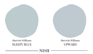
Sherwin Williams Sleepy Blue is a notable blue gray color with green undertones. With an LRV of 58 – this is a medium-toned color and can feel as dark as SW Upward. SW Sleepy Blue can be associated with a spa-like, relaxed coastal vibe! Also, yes – it lacks the purple and periwinkle undertones.
Sherwin Williams Upward vs Icy
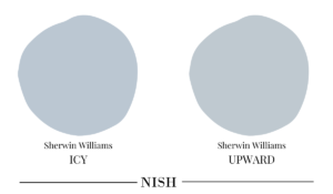
Sherwin Williams Icy definitely has more purple and periwinkle color to it! Not necessarily a neutral – Sherwin Williams Icy is a frosty blue color with just a touch of gray. It has an LRV of 56 – hence, falling on the medium to lighter end of the scale.
Sherwin Williams Upward vs Windy Blue

Just a shade darker than SW Upward – Windy Blue has an LRV of 48. It can be used as an accent or base – whether on wainscotting, doors, or shutters. This color equally feels blue gray with a touch of periwinkle to make it feel icy cool.
Where To Use Sherwin Williams Upward in Your Homes?
SW Upward can make a beautiful and organic statement in any corner of your home. Well, if you’re excited to have a look at some inspirations of how this color has been used creatively, here’s a list to follow!
Sherwin Williams Upward Bathroom
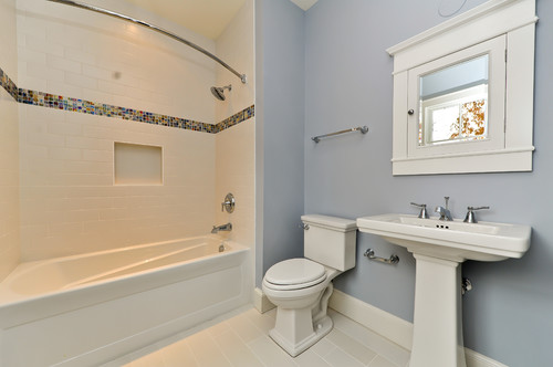
If you’re looking to achieve a crisp, cool, and calming effect in the bathroom – don’t hold back from painting the walls or vanity in Upward paint color. You can further pair this Sherwin Williams baby blue paint color with either cool or creamy white – depending upon the interior design style.
Sherwin Williams Upward Bedroom
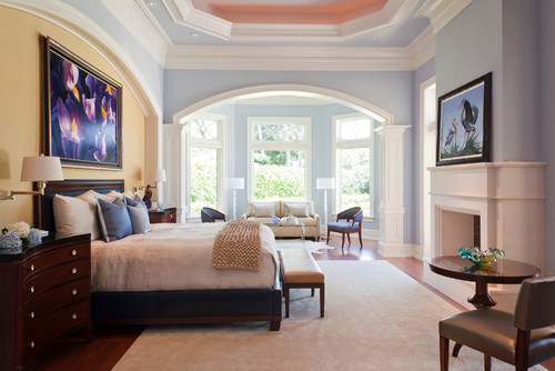
Avoid using SW Upward in the north-facing rooms since that can lead to a chilly effect in the room. Nonetheless, this color can come off beautifully in the south-facing rooms, especially if you pair it with warmer hues and fabrics such as mustard yellow, rust, or greige and beige.
SW Upward Kitchen Cabinets

Sherwin Williams Upward paint color has the utmost beauty to play in your kitchen, specifically! When painted on the cabinets, this color can truly come off as calm and serene. You can pair the SW Upward cabinets with satin brass, polished chrome, or matte black hardware finishes.
SW Upward Front Door
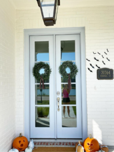
Looking to make the exteriors of your home feel warm and welcoming? Well, painting the front door in a contrasting color is the number one way to achieve that! Whether you have creamy white walls, black, gray, beige, greige, or navy blue – SW Upward on the front door will always come off soft and soothing. It’s also a great way to catch the attention of the neighbors walking by!
SW Upward Furniture
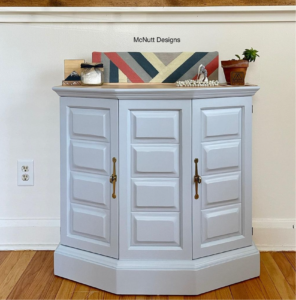
Not just the walls, cabinets, and door but you can even consider painting the accent furniture in Sherwin Williams Upward. This piece of accent furniture can be a chest in your living room, vanity in your bathroom, or a nightstand in your bedroom.
SW Upward Takeaway
Well, are you excited to incorporate this color into your home? Sherwin Williams Upward is definitely one of the soft and calming cool blue paint colors to have in your home. So, without any delay, paint that fresh coat of this baby blue color and let your home feel soothing and calm again!

