Benjamin Moore Calm is a perfect shade of a ‘timeless’ and ‘versatile’ off-white paint color. And let me tell you, it’s one of my absolute favorite Benjamin Moore off-white paint colors, for quite a few reasons. This calming and elegant off-white paint color doesn’t lean too warm or too cool – hence, proving itself to be one of the most easily paired white paint colors. However, this particular off-white paint color does have some undertones that you might have to look into! But all in all, BM Calm is a composed and subtle off-white that you can use in your home to bring the utmost calmness and serenity.
In this color review, I will be disclosing everything you need to know about Benjamin Moore Calm. We’re going to discuss the undertones, Light Reflectance Values (LRVs), where and how to use this calming white color in your home, color comparisons, FAQs, and much more! We will also discuss how this color behaves in various lighting conditions. And yes, I am going to showcase some real-time images as well! Excited much? Let’s get started!
What Color is Calm by Benjamin Moore?
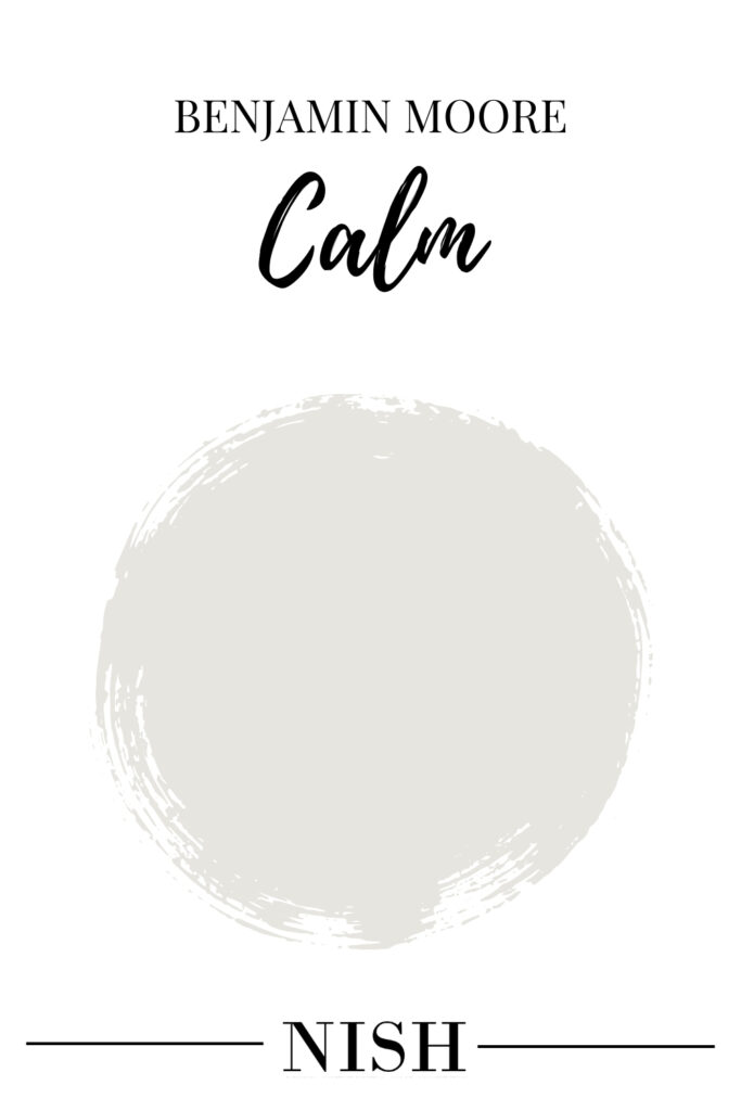
Calm by Benjamin Moore is a beautiful off-white paint color that feels calm, composed, soft, airy, and feathery. Meanwhile, this color also reflects hints of gray and subtle violet-pink undertones that would fall somewhere on the neutral to cooler end of the scale. Especially if you’re looking to make your space feel larger, airier, and brighter – BM Calm can truly do wonders. Even for interior design styles like Coastal, transitional, and Contemporary – Calm Benjamin Moore can work effortlessly. Dealing with dull and dingy corners in your home? Well, introduce BM Calm to make a beautiful impact!
There have also been certain times that I have used this composed and calming white Benjamin Moore paint color as a WHOLE HOUSE COLOR for my various E-Design and Color Consultation clients. Yes, especially if you prefer an off-white that doesn’t lean into yellow undertones in your home – BM Calm can truly do wonders. I would also recommend that you avoid using this color in warm-toned color palettes as it can counteract and come off slightly cooler.
I’d recommend that you try this ready-to-order swatch in different rooms with different lighting conditions to determine how Benjamin Moore Calm will truly feel in your home.
Click here to get a peel & stick sample of Benjamin Moore Calm
Is Benjamin Moore Calm a Warm or Cool White?
Well, Benjamin Moore Calm isn’t too warm or too cool! I’d say that this is a gray-leaning off-white with a subtle touch of brown undertones to avoid making it look too cool. All in all, this soft and feathery off-white color will look balanced, composed, and neutral without showcasing any warmth or cool and crisp undertones.
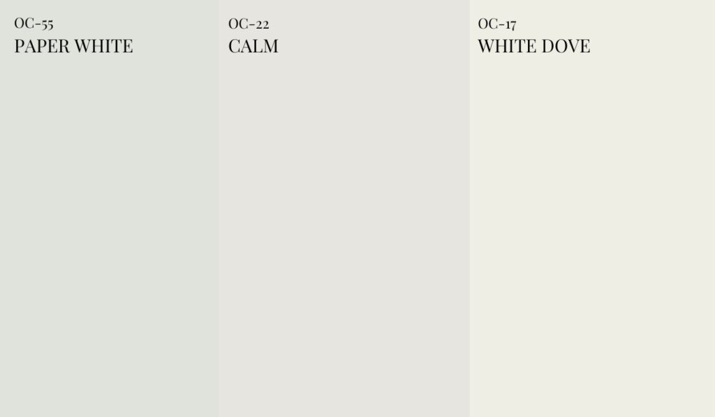
For instance, try placing a swatch of BM Calm against BM Paper White and BM White Dove. You’ll observe how neutral and neither too warm or cool BM Calm appears. On the other hand, you’ll also observe that BM Calm has a sneaky violet-pink-brown undertones with a deep gray base. BM Paper White is a cool and crisp off-white with a gray-blue-green undertone. On the other hand, BM White Dove is a soft, warm white paint color!
Can I Use Calm in a Dark Room?
Absolutely yes! BM Calm can be used in a dull, dark, and dingy room to make it feel airy, large, and bright. However, this color may dominantly showcase the sneaky violet or pink undertone if the room receives little to no natural incoming light! So, it’s advised that you supplement the room with considerable artificial lighting in the form of floor lamps, chandeliers, and table lamps.
Does BM Calm look Pink or Violet?
Definitely yes! Calm by Benjamin Moore has a wink of violet and pink undertone. And I must tell you that this is a total chameleon! It may look soft and feathery with a brown undertone in certain lighting whereas cool with a wink of purple in some. So, it’s extremely important that you sample the color in various lighting conditions and carefully use it with natural stone, hardwood, and other materials.
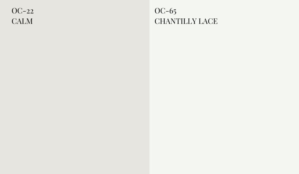
For instance, try placing a swatch of BM Calm against BM Chantilly Lace. You’ll observe a touch of pink or violet undertone in BM Calm whereas Chantilly Lace is a clean, neutral, and bright white paint color.
What are the Undertones of Benjamin Moore Calm?
Benjamin Moore Calm has a touch of violet and pink undertone that can readily make it difficult to pair with certain materials and colors. So, if you’re particularly fond of the violet or pink (taupe) undertone in an off-white paint color, only then you may choose Benjamin Moore Calm. Especially with BM Calm – you simply can’t ignore the undertones. Even though it’s a soft gray in an off-white that leans into violet and brown undertones, it may appear slightly cool or warm under certain lighting conditions. Moreover, BM Calm can look lovely in homes that have neutrals, pastels, white oak accents, gentle grays, and crisp whites. Avoid this color in homes that have golden or yellow oak, terracotta accents, and warm beiges.
Calm Benjamin Moore can tend to appear slightly different under different lighting conditions – but not majorly dominant though. In general, you can use this color in any compass direction but you must know how it will end up looking. In a room with little natural light, this color will come off quite well – yes, it’s ideal for low-light spaces. On the other hand, this color is bound to look soft and neutral also when used in a room with little natural light. Let’s discuss how this color behaves in different lighting conditions –
- In the north-facing rooms, BM Calm can appear slightly grayed out! With the incoming cool light, this color can potentially appear chilly and cold and the brown undertones can take the backstage. If you’re looking to bring warmth, avoid this color!
- In the south-facing rooms, the Calm paint color will feel soft, airy, and feathery-like! The incoming sunlight will neutralise the purple and brown undertones and make this off-white lean more into a soft, neutral white!
- In the east-facing rooms, BM Calm can appear soft and fresh during early morning hours and considerably gray and cooler in the evening hours.
- In the west-facing rooms, Calm by Benjamin Moore will look slightly grayed out in the early morning hours and considerably fresh and soft in the afternoon and evening hours.
BM Calm LRV
Light Reflectance Value or LRV is an important aspect to consider when choosing the best neutral paint color for your home. This value determines how light or dark the paint color is – on a scale of 0-100. Hence, the darker the paint color, the lower the LRV is!
In this case, BM Calm has an LRV of 78. Hence, it isn’t too dark or too light of an off-white paint color. Yes, it sits perfectly at the lighter range without going too clean or too bright. Especially if you’re looking for an off-white paint color that creates a sense of contrast with the clean white trims and ceilings – BM Calm is definitely something to have an eye for. This color will definitely bring the utmost freshness and serenity in your room.
Can I Use Benjamin Moore Calm For The WHOLE HOUSE?
Absolutely, yes! Rather, BM Calm can be a great pick for a whole house color scheme. So, if you’d like your home to feel soft, fresh, airy, modern, and large – look no further than Calm by Benjamin Moore. This refreshing and calming white paint color can be readily used on all the common walls of your home, stairways, hallways, and open-concept living and dining rooms. Moreover, if you’re dealing with a home that receives less incoming natural light – BM Calm can do wonders and brighten up all the dull corners. However, just be careful with pairing this paint color with other materials and finishes! Yes, it may not work with every kind.
Meanwhile, to ensure that Calm paint doesn’t look monotonous as a ‘whole house color’ – I’d recommend that you paint the interior doors in a contrasting hue to add a sense of visual interest and depth. You can also choose to add tinges of serene or bolder and Calm coordinating colors as accents on the accent wall, bathroom vanity, kitchen lower cabinets and island, entryway door, and built-in shelves in another contrasting hue to complete the palette. With BM Calm, you can even choose clean white doors in BM Chantilly Lace.
How To Use BM Calm Paint?
Calm BM is a soft and subtle, feathery white color that can be used in a particular space as well as a whole house color. This color can be used on all the walls of a particular room, the Whole House, the kitchen cabinets, mudroom and foyer cabinets, exterior walls, bathroom walls, kids’ rooms, and much more. Moreover, you can infuse bolder colors with respect to BM Calm as a base color in a space. Especially for interior design styles like Coastal, Cottagecore, Modern Farmhouse, French Country, and Scandinavian – this soft white color by Benjamin Moore will work beautifully.
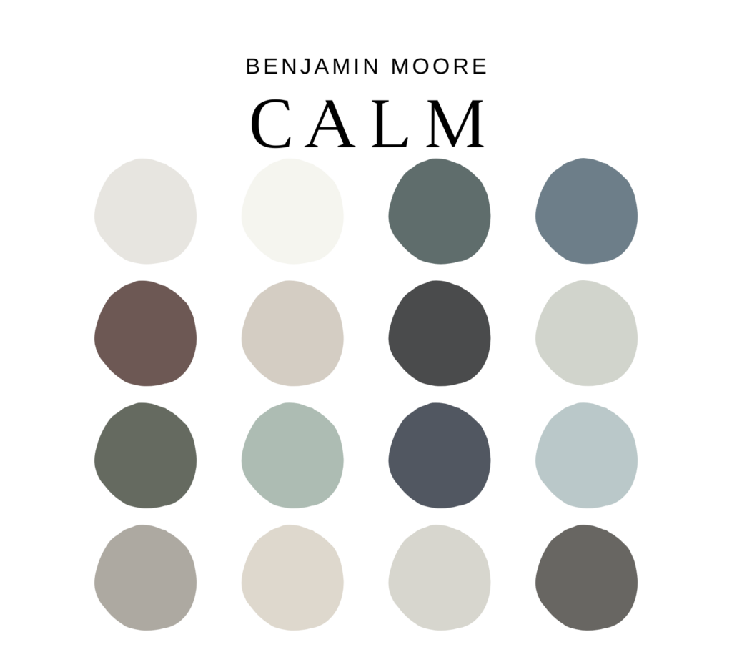
Here’s a well-curated pre-made color palette that I have created for BM Calm on Etsy! It enlists all the exact colors that pair with Calm color including how and where to use them in your whole house color palette. I have included 5 color palettes (with Benjamin Moore Calm and complementary hues) along with how to use each of those paint colors in various areas of your home. You’ll also get the detailed MATERIAL and FABRIC palette with each of BM Calm color palettes! Another bonus is PAINT PLANNER and a detailed guide on paint sheens for various areas of your home.
Here’s where you can download the palette – Benjamin Moore Calm
Where To Use BM Calm Paint in Your Home?
You can use Calm by Benjamin Moore in various areas of your home. You can either use this color as a neutral or base in a specific space or even a whole house color. Moreover, this color is a classic choice for cabinets, vanity, and your kids’ rooms as well. Here’s where you can use this BM Calm paint color –
- Exterior Walls
- Whole House including foyer and hallways
- Bedroom Walls
- Bathroom Walls
- Kids’ Rooms
- Laundry Room Walls
- Kitchen Cabinets or Walls
- Home Office Walls
- Living Room Walls
- Family Room Walls
- Dining Room Walls
What Colors Go With BM Calm?
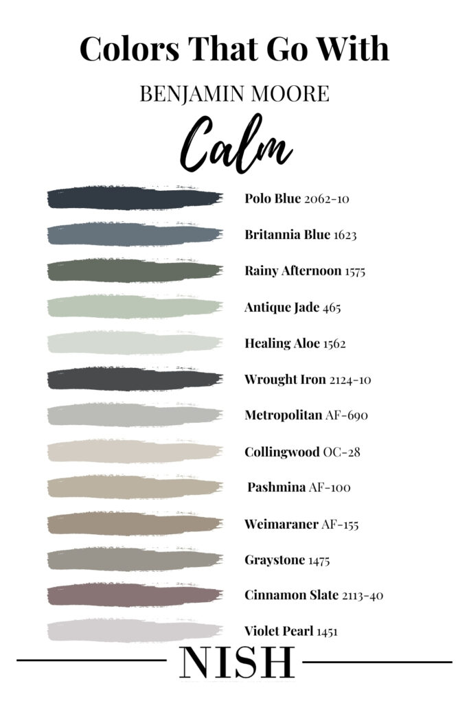
Colors that go with Benjamin Moore Calm are shades of taupe, dark violet & plums, navy or charcoal blues, blue-greens, green-grays, blue-grays, charcoal gray, cool & neutral whites, light gray and black. Avoid this color with warm beige, khaki, tan, and warm greige!
Here’s a list of Benjamin Moore blue colors that go with BM Calm –
- Benjamin Moore Polo Blue
- Benjamin Moore Brittania Blue
Now, here’s a list of Benjamin Moore green colors that go with BM Calm –
- Benjamin Moore Rainy Afternoon
- Benjamin Moore Antique Jade
- Benjamin Moore Healing Aloe
You must have a look at this list of Benjamin Moore gray and black colors that go with BM Calm –
You must have a look at this list of Benjamin Moore taupe colors that go with BM Calm –
- Benjamin Moore Collingwood
- Benjamin Moore Pashmina
- Benjamin Moore Weimaraner
- Benjamin Moore Graystone
Now, here’s a list of Benjamin Moore violet & plum colors that go with BM Calm –
- Benjamin Moore Cinnamon Slate
- Benjamin Moore Violet Pearl
What Trim Colors Go With BM Calm?
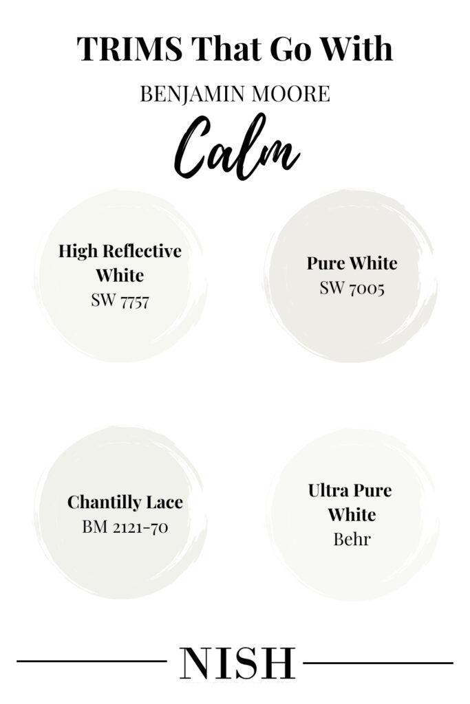
Calm by Benjamin Moore must be used with a fresh and clean white trim for a sense of visual contrast. You can even choose a neutral white paint color for the trims, moldings, and ceilings with this paint color.
Fond of the idea of color-drenching a room in BM Calm? Well, you can definitely do that! As far as your space receives considerable incoming natural light – you can definitely color drench and create a modern appeal. In a different sheen of course, for instance, choose Eggshell for the walls, semi-gloss for the trims, and matte or flat for the ceiling! Here’s a list of Benjamin Moore, Sherwin Williams, and Behr paint colors that can work as the ceiling and trim colors with BM Calm.
- Sherwin Williams Pure White
I’d personally recommend SW Pure White trims, moldings, and ceilings to go with BM Calm walls. Especially if you’re looking for a calm, clean, and seamless approach, this trim color is definitely to go! Pure White ceiling and Calm walls will make a sophisticated contrast and can be used to make your home feel timeless.
- Sherwin Williams High Reflective White
Sherwin Williams High Reflective White is a clean and bright choice for the trims, moldings, and ceiling with BM Calm walls. Especially if you have a cool-toned color palette in your home – this color on the ceilings is bound to work effortlessly.
- Benjamin Moore Chantilly Lace
BM Chantilly Lace is another clean and bright white paint that works wonderfully with Benjamin Moore Calm paint color. In the case of contemporary, modern farmhouse, Scandinavian, and modern design styles – this trim color will never disappoint you and also create a visual contrast! Definitely one of the best trim colors to go with BM Calm!
- Behr Ultra Pure White
Lightest and cleanest of them all, Behr Ultra Pure White is a clean and bright white paint that makes the ceilings appear higher and your dull corners brighter. A must-recommend for BM Calm paint color!
Where To Use Benjamin Moore Calm in Your Homes?
As mentioned earlier, Calm Benjamin Moore can make a light, clean, and crisp statement in any corner of your home. Well, if you’re excited to have a look at some inspirations of how this color has been used creatively, here’s a list to follow!
Benjamin Moore Calm Bathroom
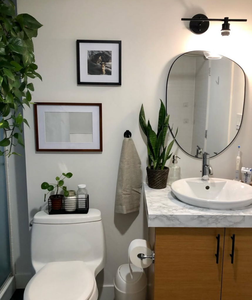
BM Calm looks lovely on the walls of your master or powder bathroom! Even with little incoming light, you can choose to paint your bathroom walls in BM Calm and further choose a clean and bright white trim. With this combination, you can add a navy blue or a black-colored vanity!
Benjamin Moore Calm Living Room
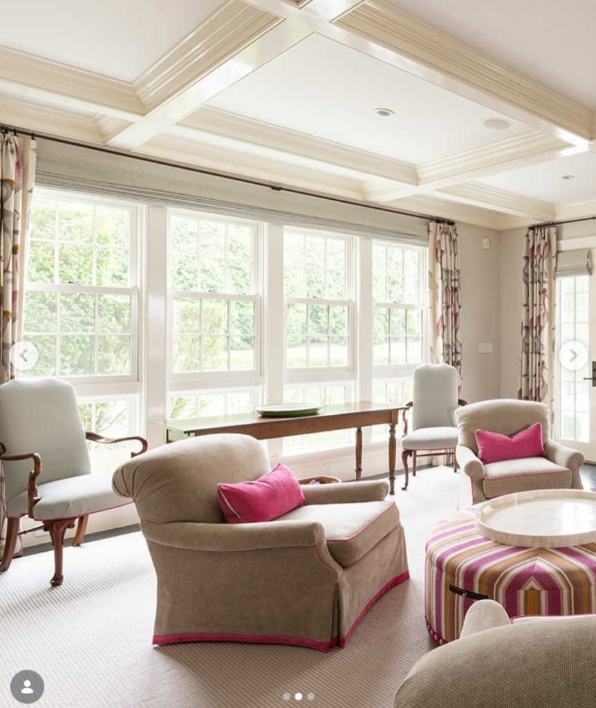
You can definitely choose BM Calm on all the common walls of your home as well as the living room walls. This calming neutral will make your space look larger, welcoming, and serene. Quite classic and neutral, you can choose to further add pops of violet and plum on the accents of your living room.
Benjamin Moore Calm Bedroom
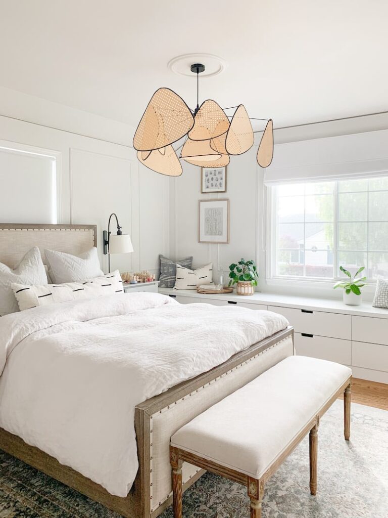
Isn’t this bedroom so calming and serene? Well, if you’re looking for a soft, muted, and calming bedroom experience – you can choose to add BM Calm on the walls. Definitely a must recommend for the south-facing, well-lit bedrooms.
Benjamin Moore Calm Kitchen Cabinets
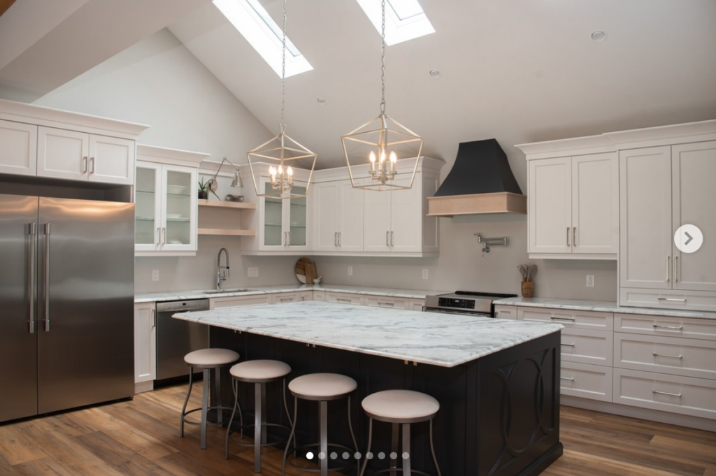
You will never regret BM Calm on the kitchen cabinets! Especially if you’re looking for a calm, composed, and serene kitchen that pairs well with white appliances and natural quartz countertop – BM Calm is definitely something to consider. It’s a great recommendation for dull and dingy kitchen spaces as well.
Benjamin Moore Calm Dining Room
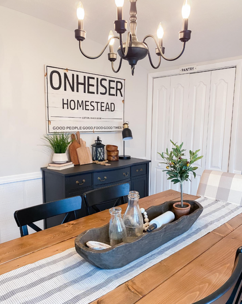
Whether or not you have BM Calm on the common walls of your home, you can definitely try BM Calm on the dining room walls. Especially for a modern farmhouse look, you can choose to paint the dining room walls in BM calm and further add BM Chantilly Lace on the wainscotting, moldings, and trims.
Benjamin Moore Calm Equivalent Colors
Comparing colors is always helpful since you get the idea of the true undertones of a paint color. After all, that’s how we know how a paint color is lighter/darker or warmer/cooler than the others!
Here, some closely similar paint colors are Benjamin Moore Classic Gray, Benjamin Moore Silver Satin, Benjamin Moore Pale Oak, and Sherwin Williams Eider White.
Let’s see how they differ!
Benjamin Moore Calm vs Benjamin Moore Classic Gray
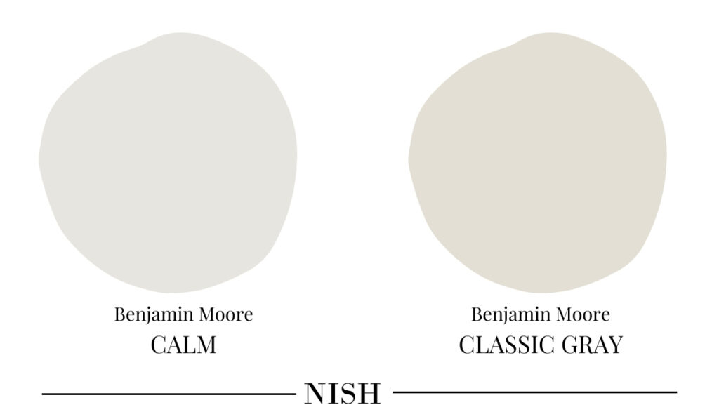
Benjamin Moore Classic Gray has an LRV of 74.78 – hence, slightly darker than BM Calm. This color can equally work great for a whole house color scheme and can also appear slightly warmer as compared to the cooler violet undertones of Benjamin Moore Calm.
Benjamin Moore Calm vs Benjamin Moore Silver Satin
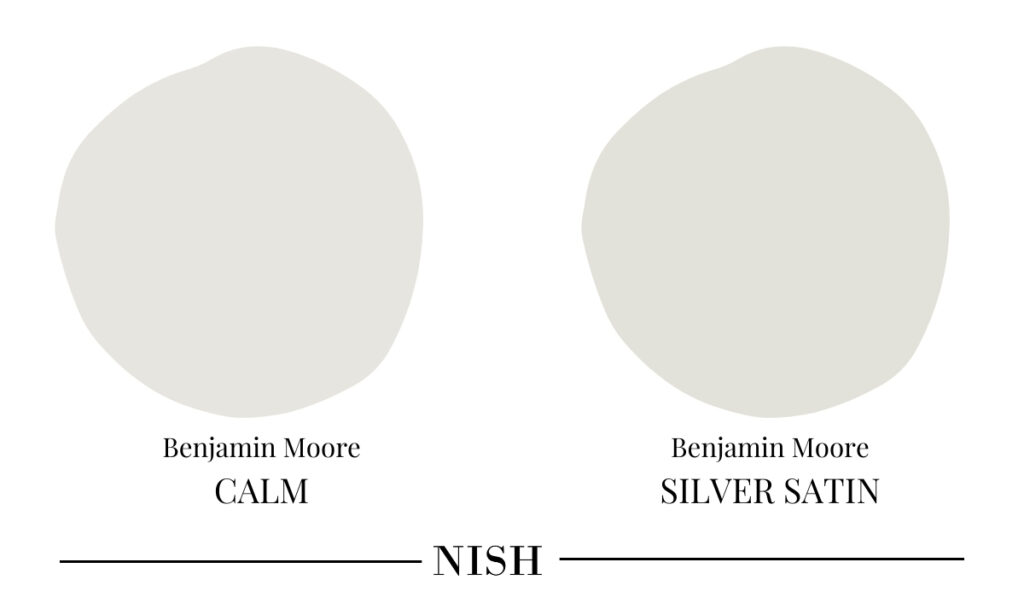
Benjamin Moore Silver Satin has an LRV of 76.35 – hence, just slightly darker than BM Calm. Although these two off-whites share a ton of similarities, BM Silver Satin is slightly less warmer with no violet or pink undertones.
Benjamin Moore Calm vs Benjamin Moore Pale Oak
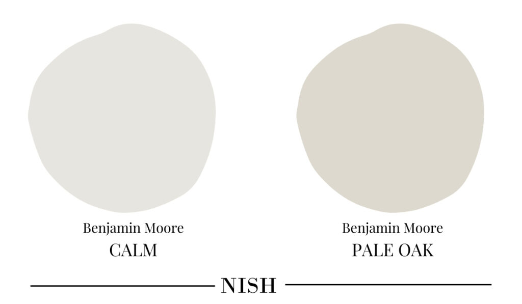
Benjamin Moore Pale Oak has an LRV of 69.89 – hence, falling on the lighter range of the ‘taupe’ scale. Yes, it’s considerably darker than BM Calm! Moreover, this color also has a violet-pink undertone but can appear slightly warmer than BM Calm. Benjamin Moore Pale Oak is a perfect shade of lighter taupe paint color.
Benjamin Moore Calm vs Sherwin Williams Eider White
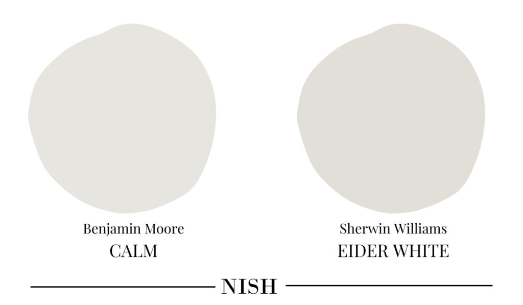
With an LRV of 73, Sherwin Williams Eider White is slightly darker than BM Calm. These two colors are quite similar to each other – due to the existing violet and pink undertones. However, SW Eider White can feel slightly warmer due to the deep brown-taupe undertone.
Benjamin Moore Calm Takeaway
Is Benjamin Moore Calm one of your favorite soft and calming off-white paint colors? Well, are you excited to incorporate this color into your home? It’s definitely one of the best off-white paint colors to have in your home as a whole house color. So, without any delay, paint that fresh coat of this versatile white color and let your home feel bright and clean again!